

Anywear Academy


anywear-academy.org


Anywear Academy
Web Design | Brand Identity | Info Architecture
I worked with UCSC Social Emotional Tech (SET) Lab to create a website and brand identity for a research project they were taking public. I was the sole designer and was responsible for everything from research, design, and implementation. This was a 7-month long project.
The Challenge
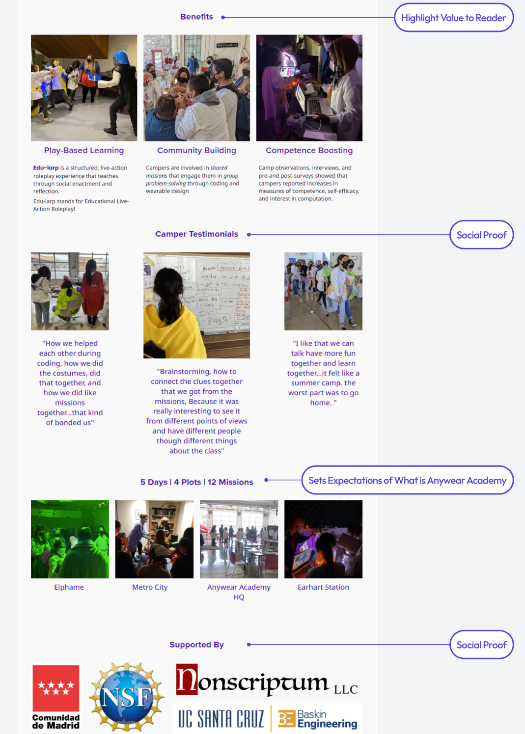
For 5 years, they'd been running Anywear Academy, a camp that blended coding, crafting, and team building through edu-larping (educational roleplay). Girls who participated showed increased confidence in STEM and saw themselves as makers and coders. The curriculum was amazing, but it was trapped in academic research language on a confusing website. The lab wanted to share their method as a curriculum- to inspire educators worldwide to run their own versions and empower more girls in STEM.
Understanding the Problem
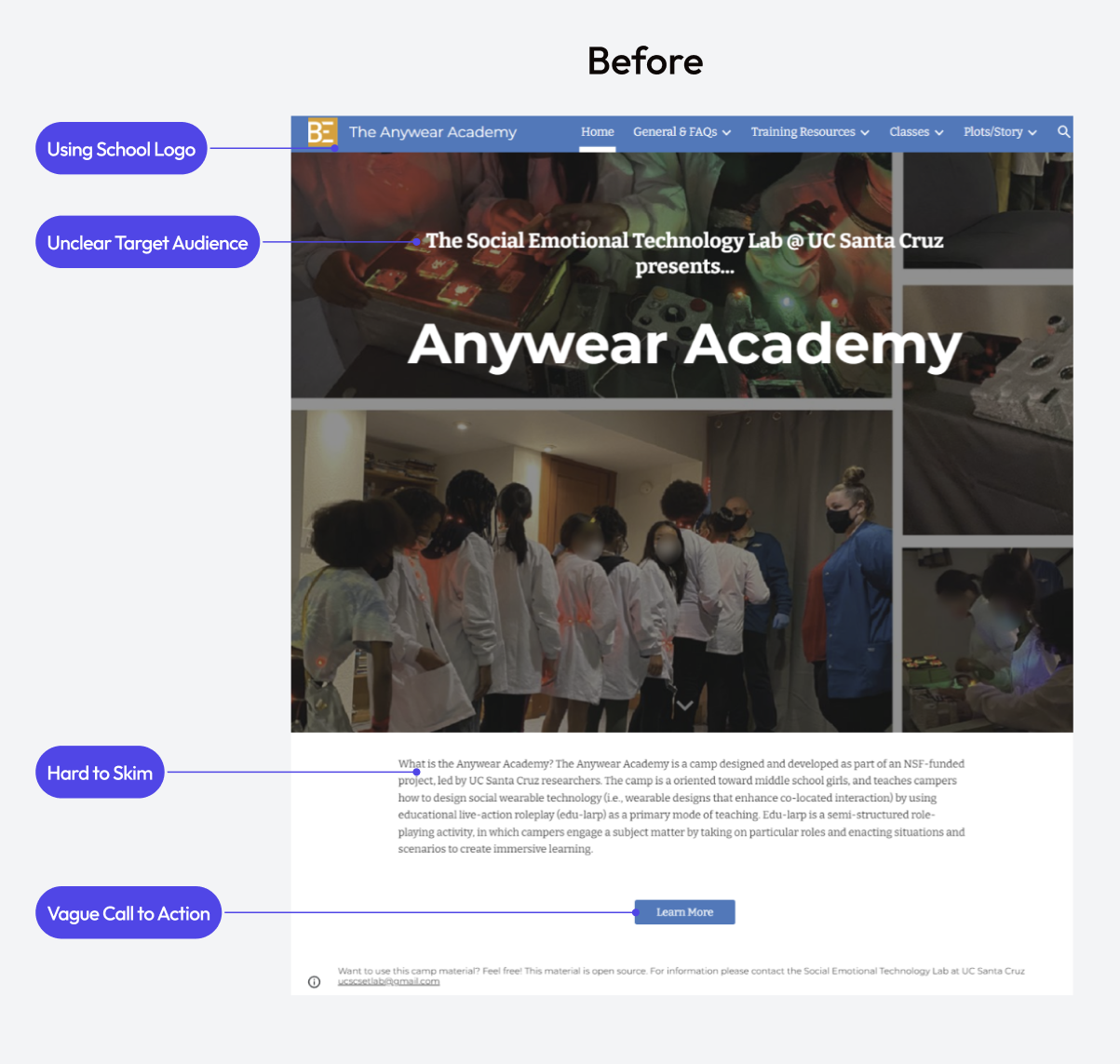
I started by testing the existing website with a summer theatre instructor (a sample of our target audience). Three big problems emerged:
- It felt like a research project, not a toolkit. The only hint that others could use it was tiny footer text saying "Want to use this camp material? Feel free!"
- It looked too academic. UCSC branding and School of Engineering logos made it feel like a university extension, not something for the public.
- The audience was unclear. Teachers? Researchers? Summer camps? The confusion made navigation impossible - lots of small text, big paragraphs, minimal headings, confusing pictures.
I walked away with a clear mission: repackage 5 years of research into an easy-to-digest DIY product that would make teachers curious and excited to try it themselves.
Research and Strategy
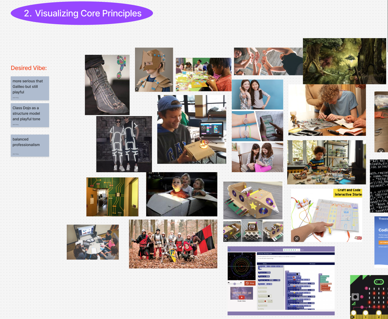
To tackle this reframing, I conducted a competitive audit of websites for teachers (ClassDojo), summer camps (Galileo), and framework sharing (DEAL).
I was drawn to ClassDojo's colorful, smiling mascots and Galileo's engaging photography. These became my two focus areas for changing perception: logo/branding and photography would transform Anywear Academy from "research project" to "fun DIY curriculum."
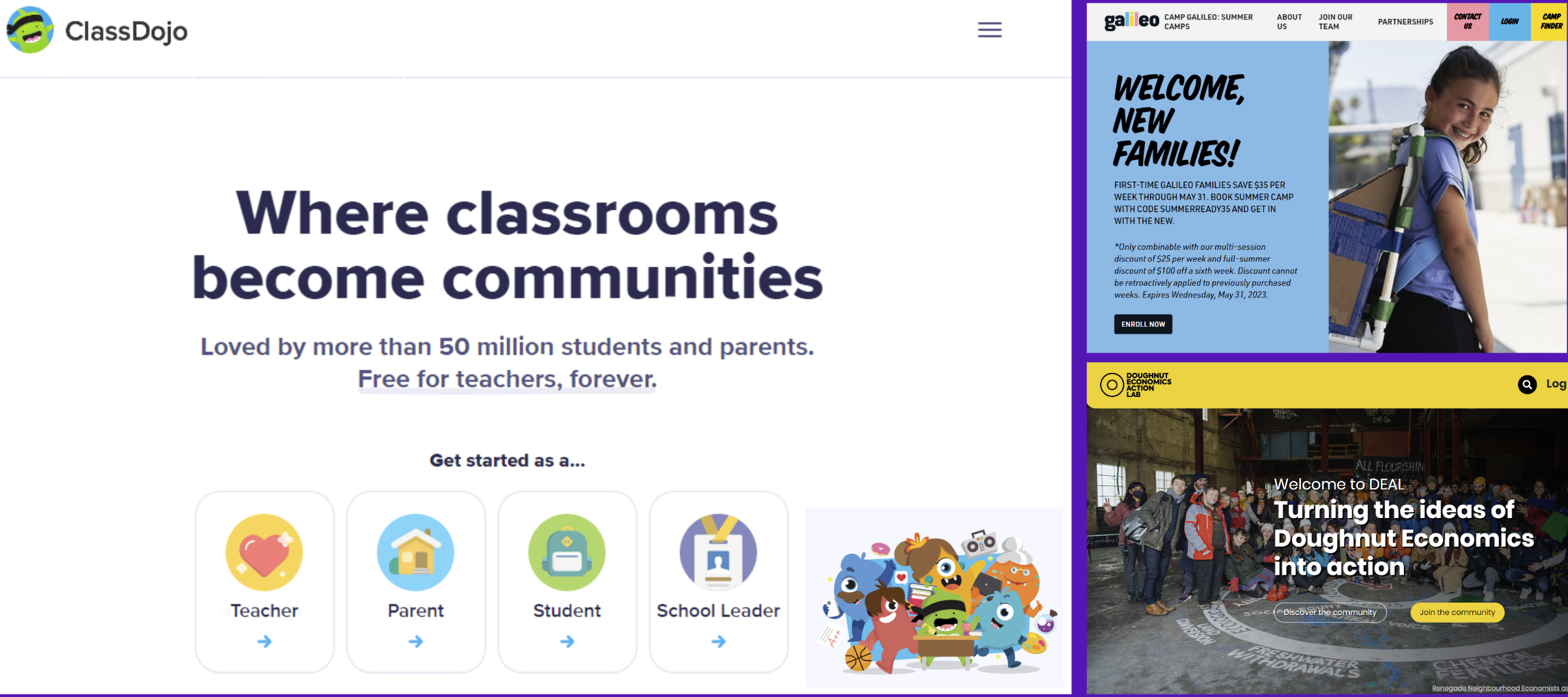
I was inspired by the colorful and friendly mascots in ClassDojo to create a logo for AA that had a smiling face.
Solving the Visual Problems
Photography Challenge
The photography issue was huge. Because this was a research project with children, all photos used on the original website had the children's faces blurred. This made the camp look secretive instead of joyful. I convinced the lead researcher to track down signed photo waivers from different camp batches. This took serious work on their end, but authentic photos of happy kids would completely change how the program felt.
Brand Design
I conducted 3 structured brainstorming sessions with lab interns unfamiliar with Anywear Academy to capture an outsider's perspective. We moved through three phases: initial word association to capture the program's essence, visual mood boarding to expand our understanding, and symbolic exploration to identify abstract concepts that could translate to logo imagery.
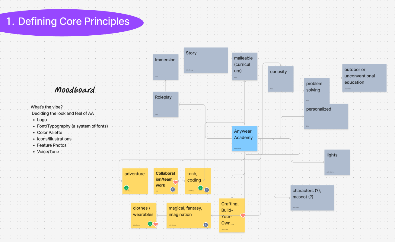
Out of the many words we then voted on the top three words: Adventure, Collaboration, Tech/Coding, Clothes/Wearables, Fantasy/Magical, Crafting/DIY
Using our refined brand principles, I input targeted keywords into AI logo generators to rapidly explore visual directions. The AI outputs revealed recurring themes of fantasy symbols (crowns, castles) and adventure imagery (shields, swords) that aligned with our "magical/adventure" and "fantasy" principles.
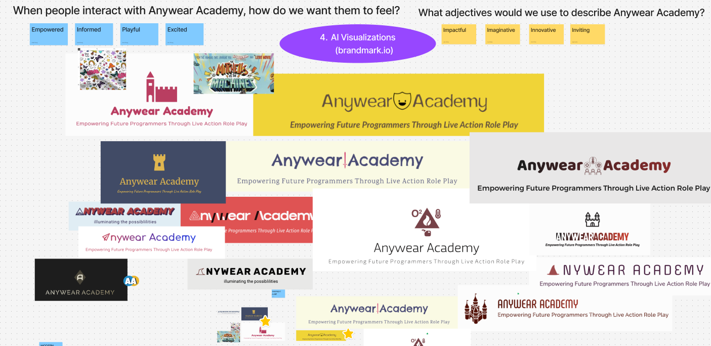
Using an AI logo generator helped me iterate through ideas quickly.
I selected the strongest concepts from AI exploration and recreated them as custom vector graphics. My first attempt was a sword and shield .The researchers thought it felt too masculine, so I went back to the drawing board.
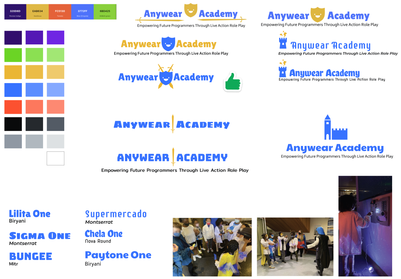
The castle and tower I later kept as reusable illustrations for the brand kit.
My second attempt of a smiling crown was better: fantasy roleplay meets empowerment, and purple/gold felt royal without being gendered. However, it was missing the STEM and coding component.
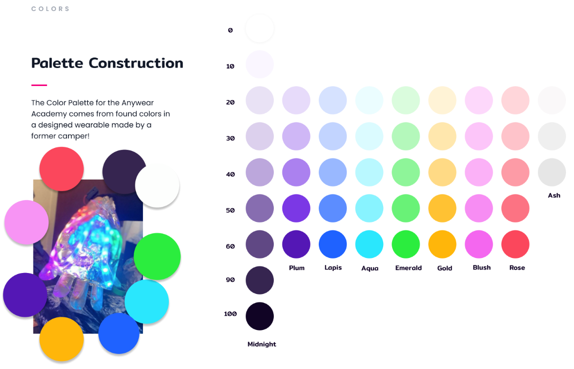
Rather than using generic color schemes, I extracted the brand palette directly from a wearable device created by a former camper, featured in the lab's research documentation. This approach ensured the brand colors had authentic connection to the program's actual impact and student creativity.
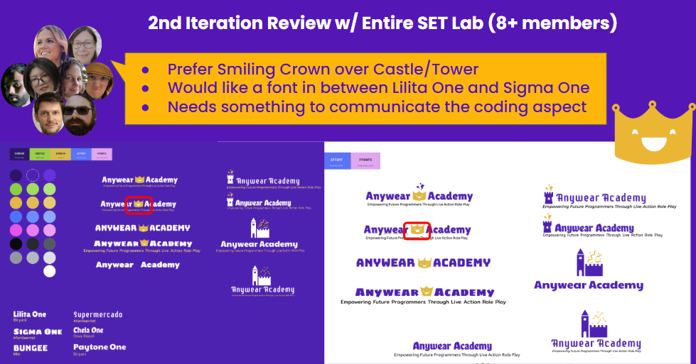
After refining with two brand designers, I built out the complete brand kit with crown illustrations (based on the research team) and patterns incorporating coding/STEM elements. The brand kit was used in the main promotional video on the home page showing how my design system extended beyond static assets to tie everything together.
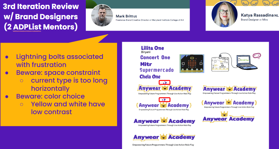
After three rounds of review, I had narrowed it down to two logo designs. The final verdict was up the lead researcher and they chose the unlined crown with the big bold font and dot and line pattern.
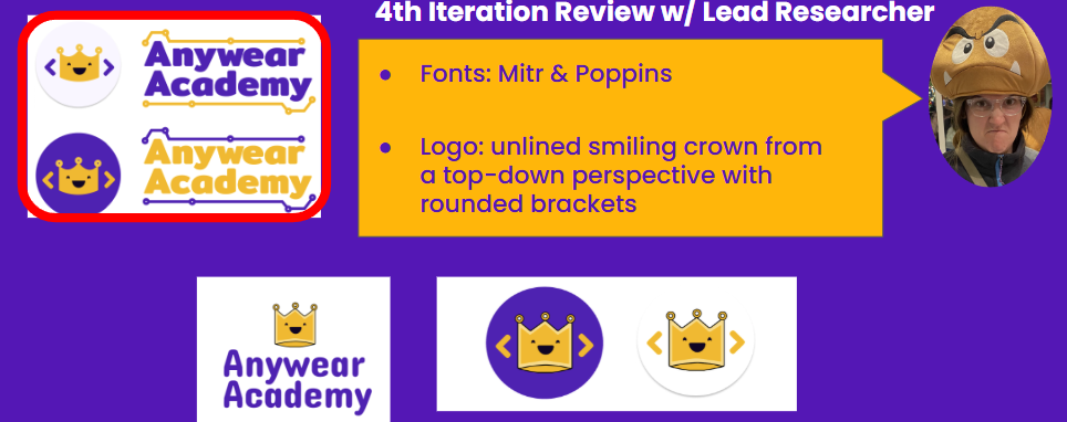
I liked the other crown better :P
Information Architecture Overhaul
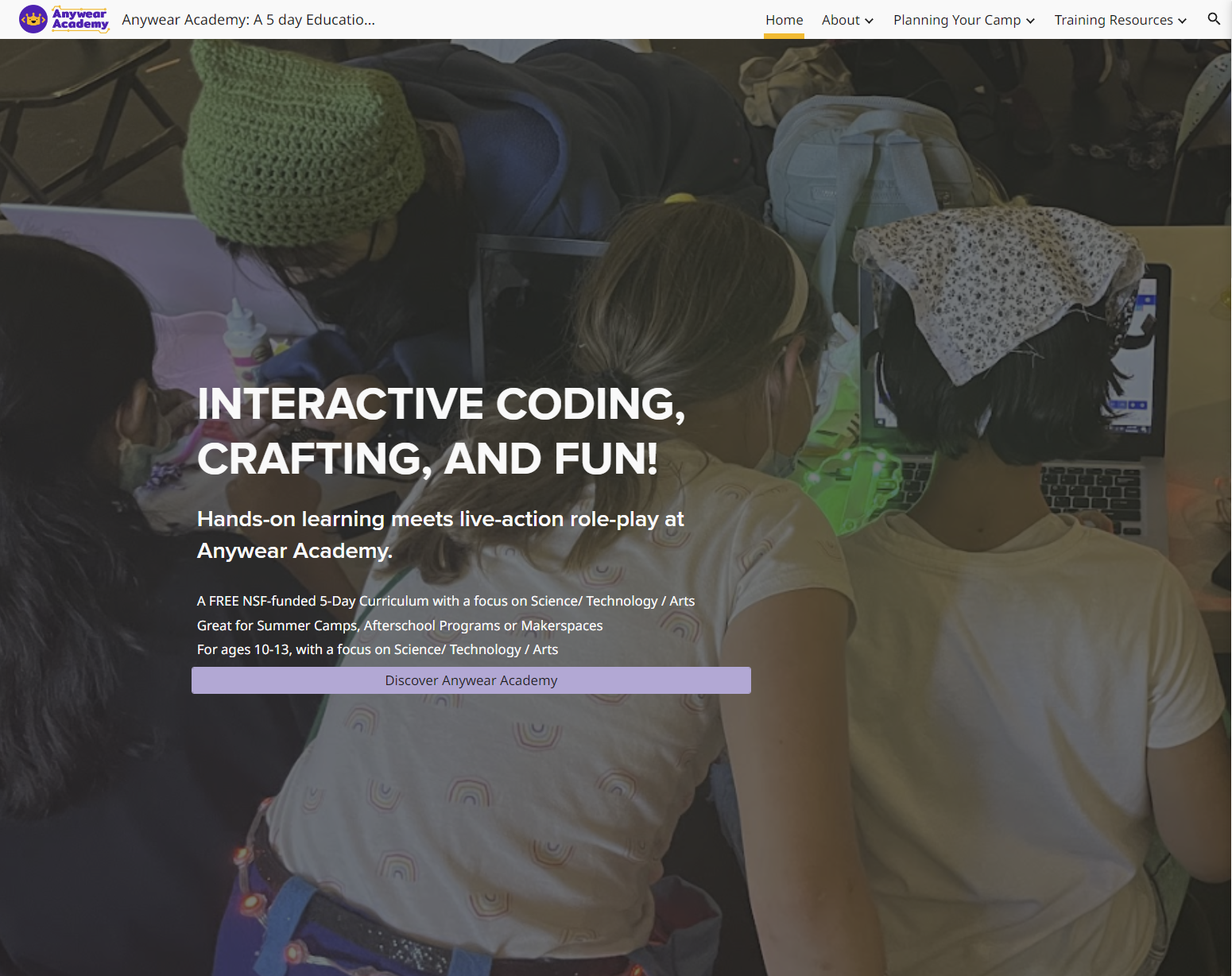
This was the bulk of the project. Working with the lead researcher and former camp staff, I audited all content and translated research language into teacher-friendly copy. Figuring out how to make section names self-explanatory was challenging. At first, I wanted to put everything on the homepage to tell the complete story. But after reviews with past educators and edu-larp instructors, I learned less was more. The final version quickly conveyed what Anywear Academy offered, then let people dive deeper on other pages.
The new structure:
- Home: Quick overview of what AA is, who it's for, and what educators can expect
- About: Detailed background, research, and team info
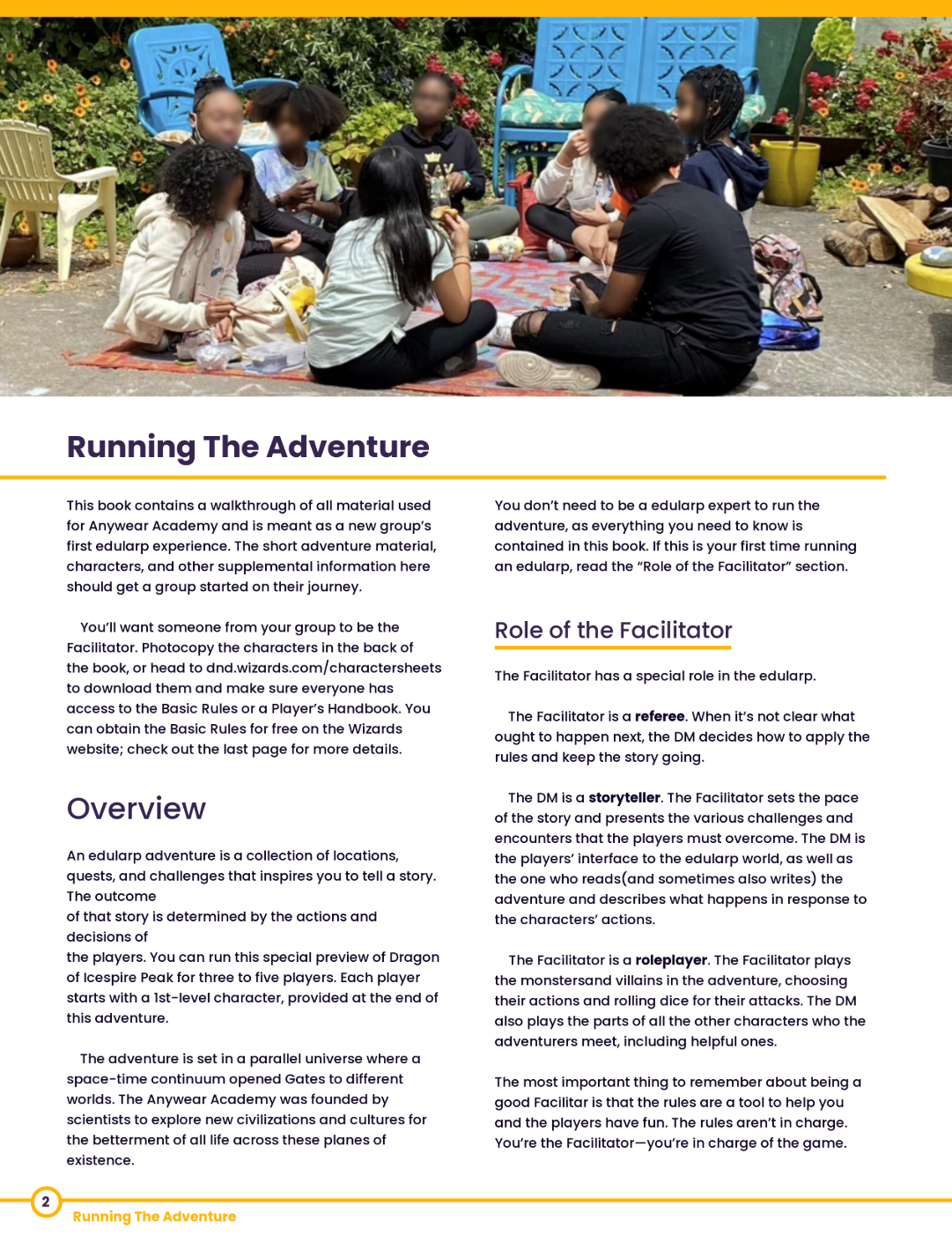
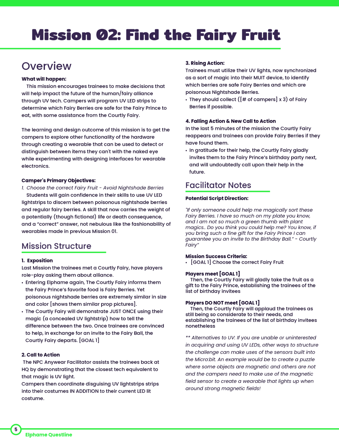
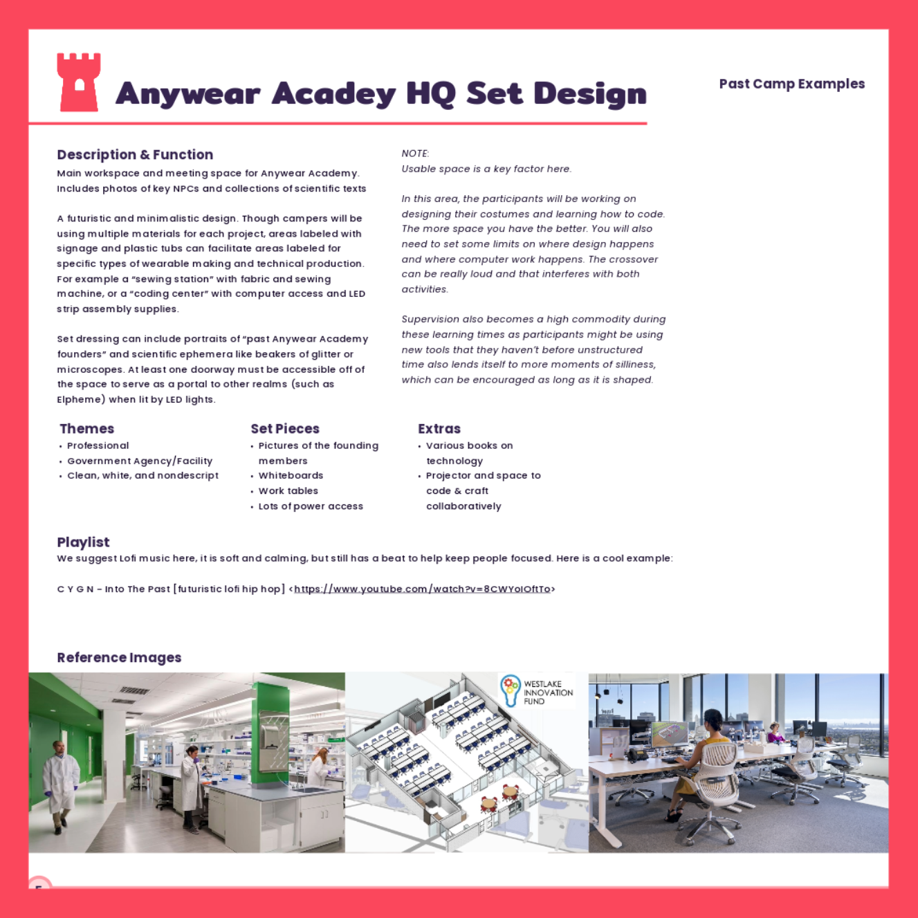
- Planning Your Camp: The how-to section with curriculum setup, schedules, materials, character scripts, and missions
- Training Resources: Everything for the main facilitator and training others
Bonus Feature (Unlaunched)
I also created PDF versions of all website content, thinking teachers would want printed materials while actually running the camp rather than referencing the website. The research team loved this idea, but it wasn't in the original budget. Given more time on this project, completing these branded PDF assets would be my first priority - making the curriculum even more accessible to educators in real classroom settings.
I had so much fun making these pdfs and am so proud of how they extended the brand.
Results
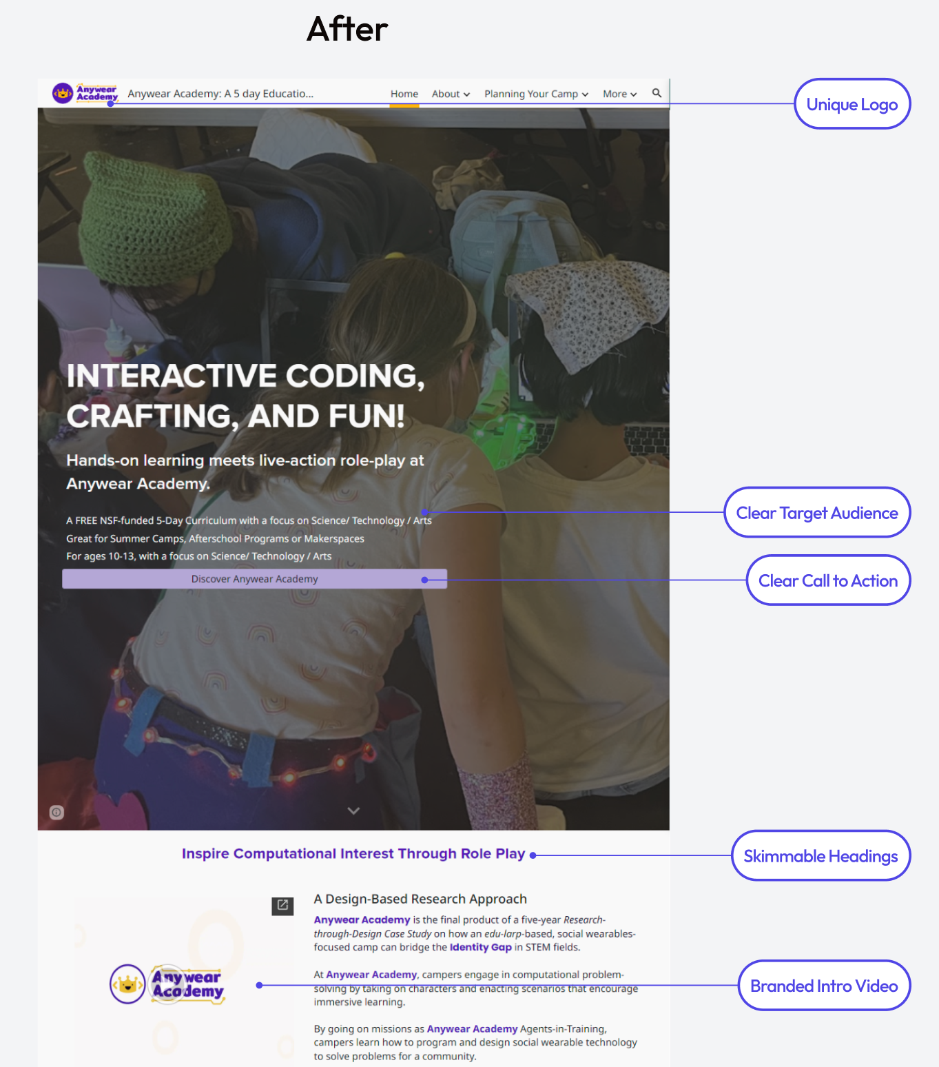
The rebrand worked. What started as scattered university research became a clear, exciting toolkit that educators could actually picture using with their own kids.
The new brand guide gave the website a complete makeover that felt appropriate for its educator audience, and the reorganized information architecture made the curriculum accessible to teachers worldwide.
Multiple educators reviewed the final site and could immediately understand what Anywear Academy was and how they could implement it - a complete transformation from the original confusion.


Anywear Academy


anywear-academy.org


Anywear Academy
Web Design | Brand Identity | Info Architecture
I worked with UCSC Social Emotional Tech (SET) Lab to create a website and brand identity for a research project they were taking public. I was the sole designer and was responsible for everything from research, design, and implementation. This was a 7-month long project.
The Challenge
For 5 years, they'd been running Anywear Academy, a camp that blended coding, crafting, and team building through edu-larping (educational roleplay). Girls who participated showed increased confidence in STEM and saw themselves as makers and coders. The curriculum was amazing, but it was trapped in academic research language on a confusing website. The lab wanted to share their method as a curriculum- to inspire educators worldwide to run their own versions and empower more girls in STEM.
Understanding the Problem
I started by testing the existing website with a summer theatre instructor (a sample of our target audience). Three big problems emerged:
- It felt like a research project, not a toolkit. The only hint that others could use it was tiny footer text saying "Want to use this camp material? Feel free!"
- It looked too academic. UCSC branding and School of Engineering logos made it feel like a university extension, not something for the public.
- The audience was unclear. Teachers? Researchers? Summer camps? The confusion made navigation impossible - lots of small text, big paragraphs, minimal headings, confusing pictures.
I walked away with a clear mission: repackage 5 years of research into an easy-to-digest DIY product that would make teachers curious and excited to try it themselves.
Research and Strategy
To tackle this reframing, I conducted a competitive audit of websites for teachers (ClassDojo), summer camps (Galileo), and framework sharing (DEAL).
I was drawn to ClassDojo's colorful, smiling mascots and Galileo's engaging photography. These became my two focus areas for changing perception: logo/branding and photography would transform Anywear Academy from "research project" to "fun DIY curriculum."
I was inspired by the colorful and friendly mascots in ClassDojo to create a logo for AA that had a smiling face.
Solving the Visual Problems
Photography Challenge
The photography issue was huge. Because this was a research project with children, all photos used on the original website had the children's faces blurred. This made the camp look secretive instead of joyful. I convinced the lead researcher to track down signed photo waivers from different camp batches. This took serious work on their end, but authentic photos of happy kids would completely change how the program felt.
Brand Design
I conducted 3 structured brainstorming sessions with lab interns unfamiliar with Anywear Academy to capture an outsider's perspective. We moved through three phases: initial word association to capture the program's essence, visual mood boarding to expand our understanding, and symbolic exploration to identify abstract concepts that could translate to logo imagery.
Out of the many words we then voted on the top three words: Adventure, Collaboration, Tech/Coding, Clothes/Wearables, Fantasy/Magical, Crafting/DIY
Using our refined brand principles, I input targeted keywords into AI logo generators to rapidly explore visual directions. The AI outputs revealed recurring themes of fantasy symbols (crowns, castles) and adventure imagery (shields, swords) that aligned with our "magical/adventure" and "fantasy" principles.
Using an AI logo generator helped me iterate through ideas quickly.
I selected the strongest concepts from AI exploration and recreated them as custom vector graphics. My first attempt was a sword and shield .The researchers thought it felt too masculine, so I went back to the drawing board.
The castle and tower I later kept as reusable illustrations for the brand kit.
My second attempt of a smiling crown was better: fantasy roleplay meets empowerment, and purple/gold felt royal without being gendered. However, it was missing the STEM and coding component.
Rather than using generic color schemes, I extracted the brand palette directly from a wearable device created by a former camper, featured in the lab's research documentation. This approach ensured the brand colors had authentic connection to the program's actual impact and student creativity.
After refining with two brand designers, I built out the complete brand kit with crown illustrations (based on the research team) and patterns incorporating coding/STEM elements. The brand kit was used in the main promotional video on the home page showing how my design system extended beyond static assets to tie everything together.
After three rounds of review, I had narrowed it down to two logo designs. The final verdict was up the lead researcher and they chose the unlined crown with the big bold font and dot and line pattern.
I liked the other crown better :P
Information Architecture Overhaul
This was the bulk of the project. Working with the lead researcher and former camp staff, I audited all content and translated research language into teacher-friendly copy. Figuring out how to make section names self-explanatory was challenging. At first, I wanted to put everything on the homepage to tell the complete story. But after reviews with past educators and edu-larp instructors, I learned less was more. The final version quickly conveyed what Anywear Academy offered, then let people dive deeper on other pages.
The new structure:
- Home: Quick overview of what AA is, who it's for, and what educators can expect
- About: Detailed background, research, and team info
- Planning Your Camp: The how-to section with curriculum setup, schedules, materials, character scripts, and missions
- Training Resources: Everything for the main facilitator and training others
Bonus Feature (Unlaunched)
I also created PDF versions of all website content, thinking teachers would want printed materials while actually running the camp rather than referencing the website. The research team loved this idea, but it wasn't in the original budget. Given more time on this project, completing these branded PDF assets would be my first priority - making the curriculum even more accessible to educators in real classroom settings.
I had so much fun making these pdfs and am so proud of how they extended the brand.
Results
The rebrand worked. What started as scattered university research became a clear, exciting toolkit that educators could actually picture using with their own kids.
The new brand guide gave the website a complete makeover that felt appropriate for its educator audience, and the reorganized information architecture made the curriculum accessible to teachers worldwide.
Multiple educators reviewed the final site and could immediately understand what Anywear Academy was and how they could implement it - a complete transformation from the original confusion.
