
Bird School Project
Education Design | Illustration | User Research
I worked with the Bird School Project to create 2 custom kid-friendly field guides for their curriculum. I was the sole designer and was responsible for everything from research, design, and implementation. This was a 6-month long project.
The Context
During my internship with Bird School Project (BSP), I worked as an outdoor education instructor. BSP is a nonprofit that partners with Santa Cruz middle school science teachers to teach students scientific thinking through birdwatching. We'd visit classrooms for 4 consecutive lessons covering different aspects of bird observation.
Each class included indoor sessions covering basics like bird characteristics and flight evolution, followed by outdoor sessions where students used binoculars and field guides to observe birds in their school backyard. Students would note bird behavior, coloration, calls, and flight patterns, then form hypotheses and share findings.
Noticing a Problem
I noticed students' attention was most likely to wander during the indoor classroom sessions. Walking around to check on groups, I realized our teaching materials weren't working well for this age group—mostly dense ornithology field guides and natural history books with small text that weren't kid-friendly.
When I carried my small sketchbook for personal notes, kids showed more interest and willingness to engage. I saw similar increased engagement during outdoor sessions when I sketched observations alongside students. After seeing my sketches of the birds we observed, students became more excited about making their own observations and sharing them. My supervisor had also noticed this difference and commented on how my sketches captured students' attention.
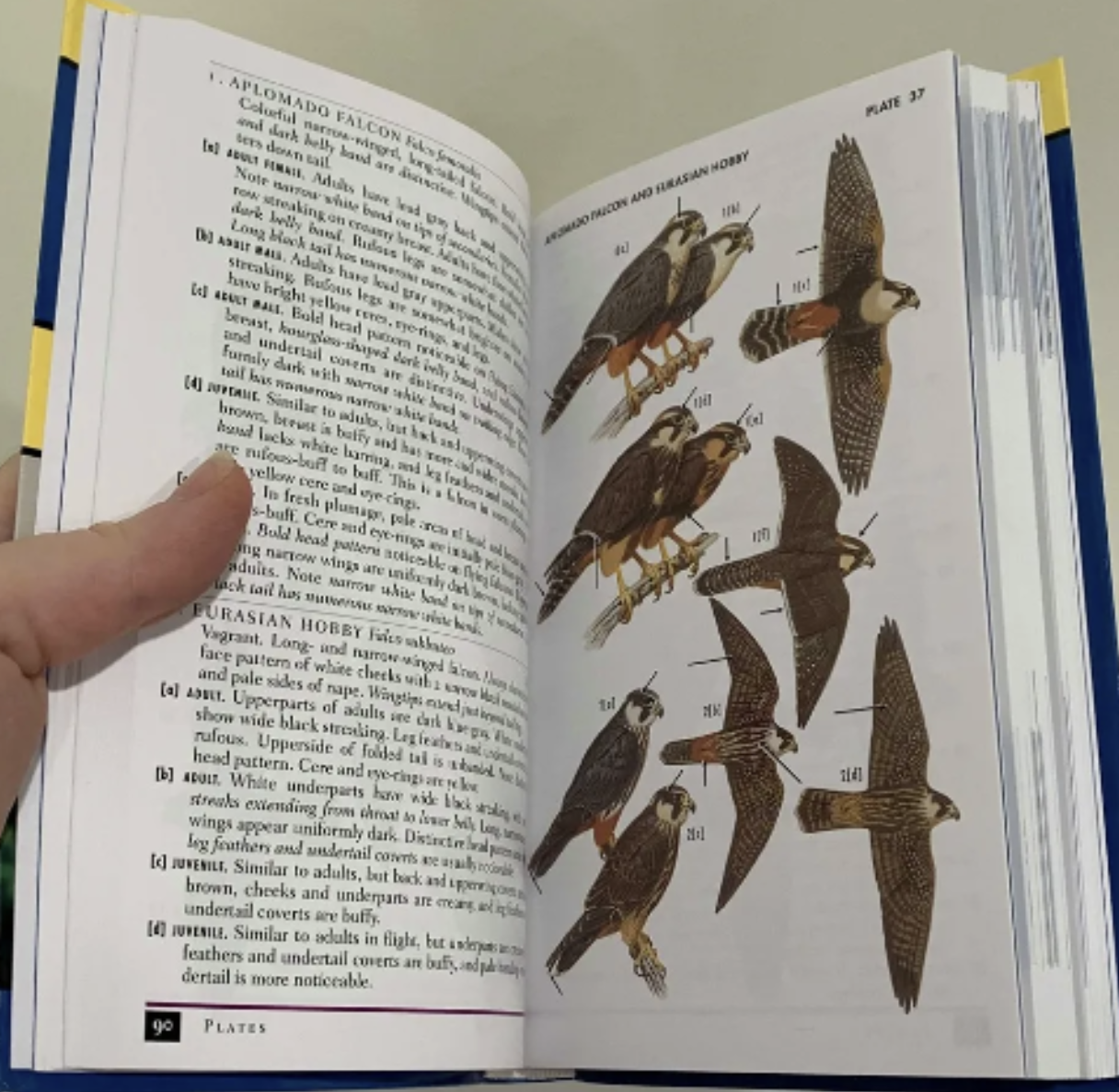
Example of some of the birding books used at BSP.
The Opportunity
When my internship ended, my supervisor Kevin and I discussed the idea of creating custom field guide booklets to complement the course units. After seeing that existing educational materials weren't appealing to younger audiences, we decided to develop kid-friendly field guides that both BSP and the general public could use. We started the project at the beginning of the next school year, first determining what was realistic to complete in 3 months. We settled on covering 2 units: Wings and Feathers.
The Design Process
Planning and Research
I made small thumbnail sketches and used my intern experience to organize what information to include and how to structure it. I was responsible for all illustration, design, and content writing.
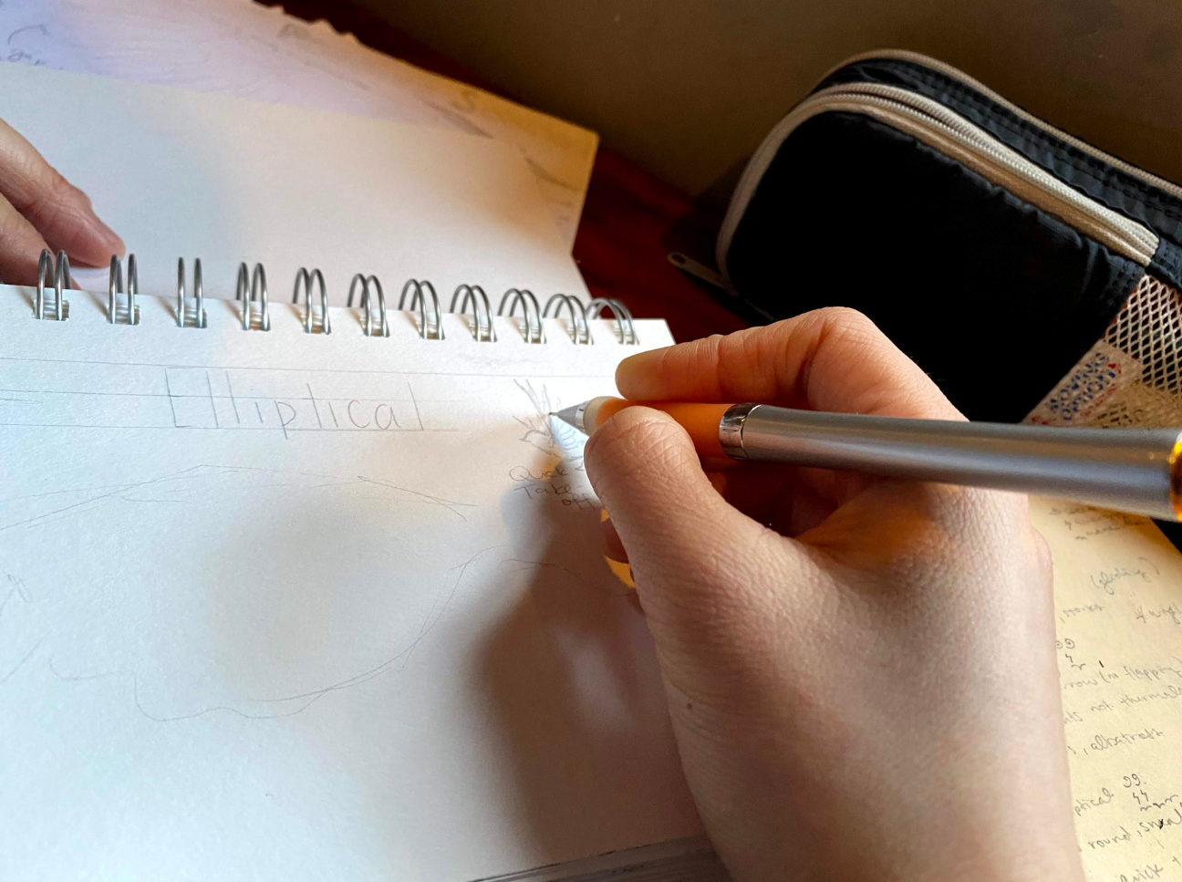
Sketching helped me get ideas flowing. Working on paper always felt less final than working directly on Canva.
Creating the Illustrations
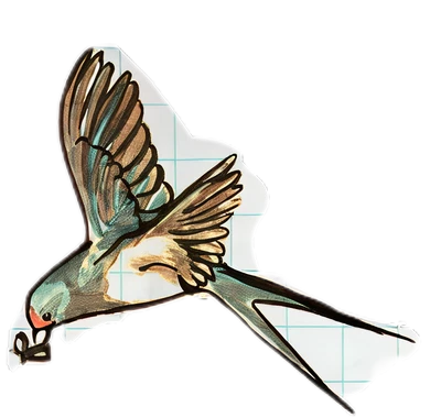
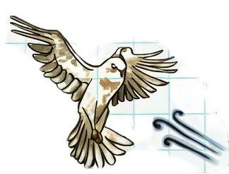
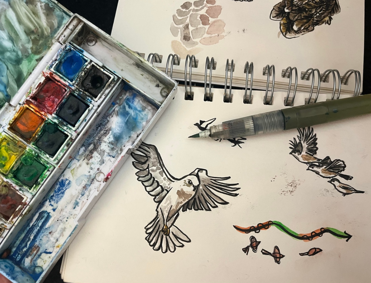
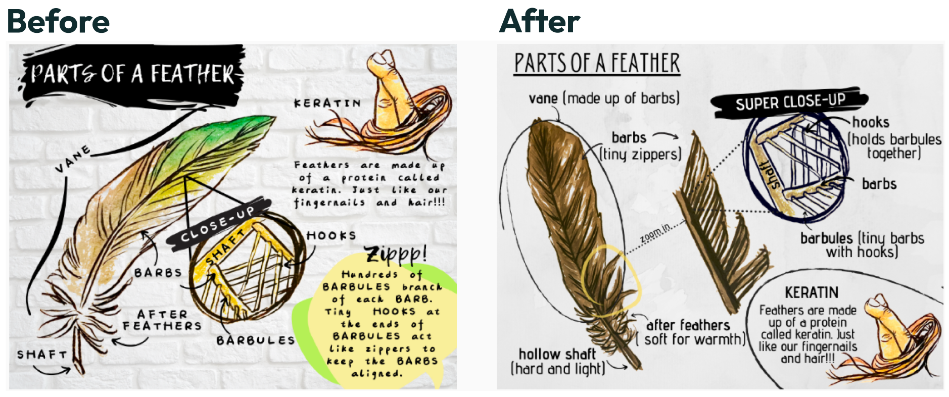
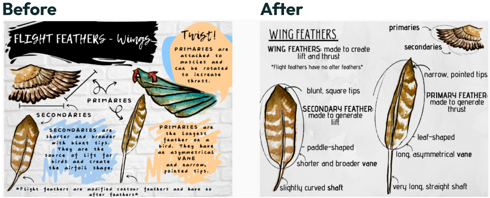
I created over 30 watercolor paintings of birds, wings, and feathers, working from real specimens using taxidermized materials from the natural history museum. I chose to hand-draw and color illustrations on paper to achieve a natural sketchbook look, then scanned and uploaded images into Canva for digital arrangement.
Working within Constraints
The small page size actually helped focus my content. I could only fit a title, fun fact, and text labels next to illustrations. This constraint forced me to be concise and clear.
Design Challenges and Solutions
Wings Guide Issues
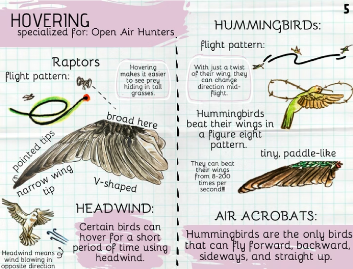
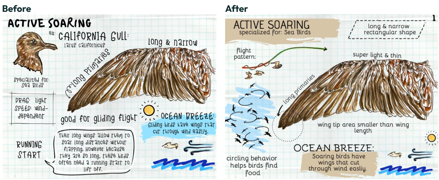
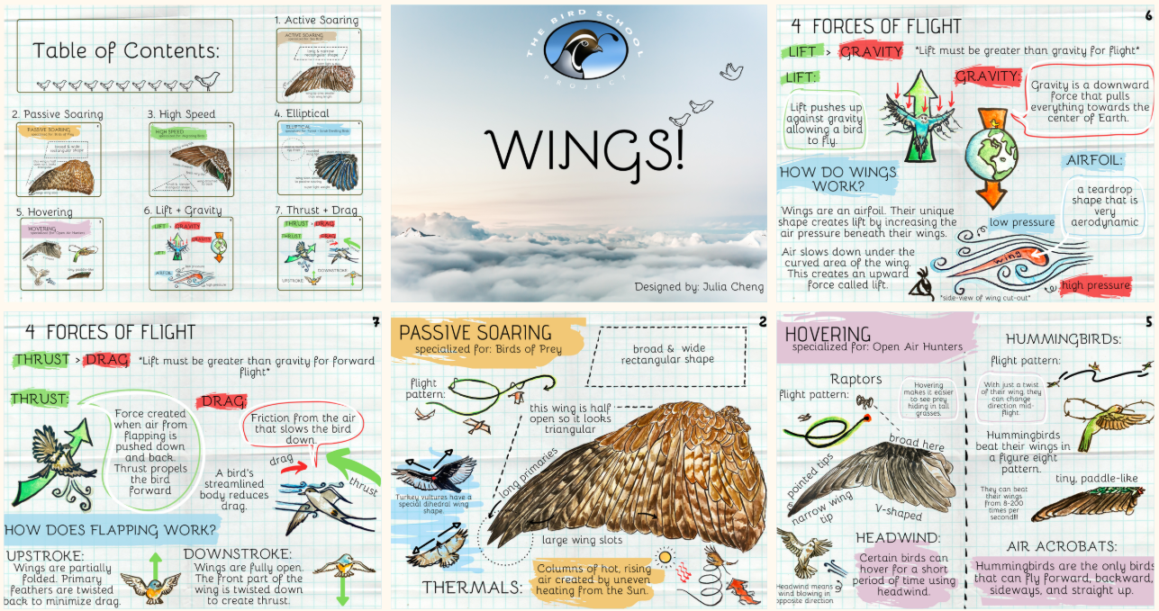
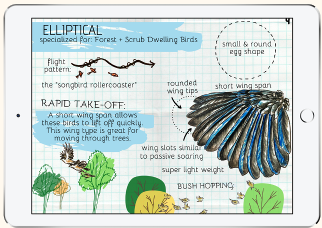
My main challenge was breaking down information into standard characteristics for each wing type and formatting this clearly. I learned to use color blocks to separate information and prevent pages from feeling text-heavy. I also improved image distribution so they didn't cluster in the middle or edges.
After several reviews, I found a page template to follow so all the wing pages would include:
- Wing Name & Shape
- Specialization
- Flight Pattern
- Labeled Wing
- At least one fun fact
Simplifying the physics of flight for young readers was challenging since concepts like air density, acceleration, and friction are complex. This became a good test of my own understanding.
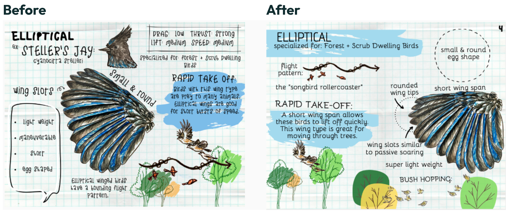
I removed the advantage and disadvantage boxes for how each wing affected flight forces because it wasn’t concretely useful.
Before
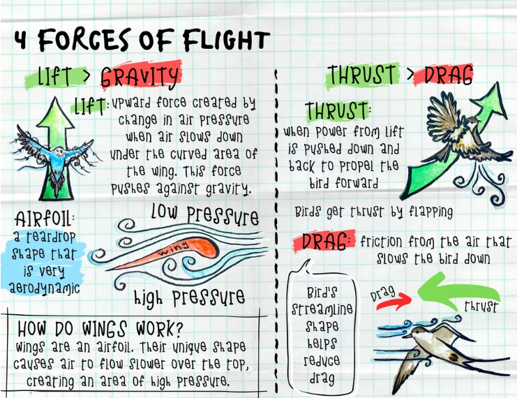
Before: I squeezed all four forces together on one page. Even though everything technically fit, it looked crowded and was hard to read.
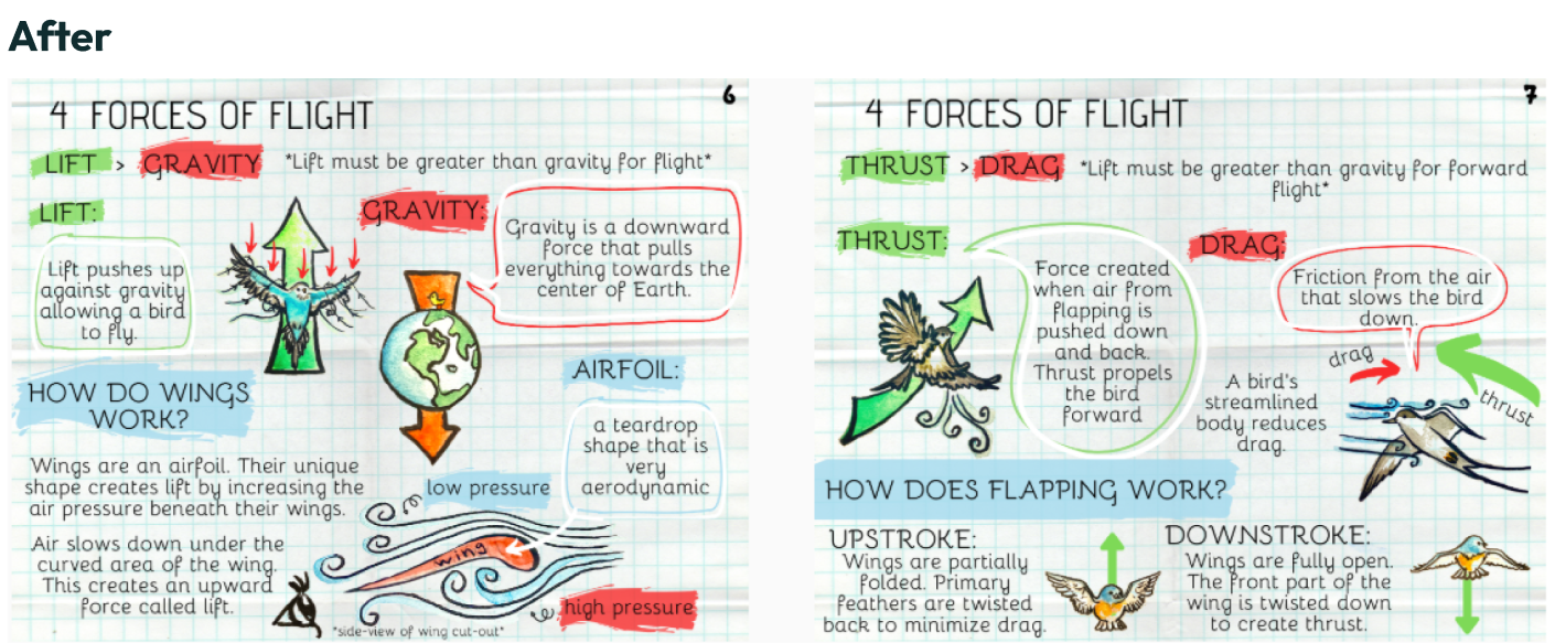
After: I split the four forces into two pages, each focusing on one opposing pair of forces. This allowed more depth while improving spacing.
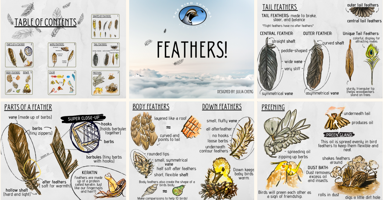
Feathers Guide Issues
I struggled between presenting information in an appealing aesthetic style while keeping it clearly displayed. My first iteration used fonts and bright colors that were too noisy and distracting from the information.
We aimed for a scientist's observational notes style—more descriptive labels, fewer paragraphs. In my second iteration, I toned down the visuals but went too bland. The first version may have been too artistic, but the second felt flat and lifeless.
I was less confident about feather content than wing content, which led me to rely more on words than illustrations in the Feathers guide. I learned that unfamiliarity with content can be a mental block to creative design solutions.
Feedback and Iteration
My guides were reviewed by educators from BEETLES (science teaching organization for field instructors). The content feedback was positive, but visual design and page layouts needed work.
Key suggested changes:
- Make pages look like field journal entries
- Avoid unnecessarily complex vocabulary
- Simplify font types
- Ensure information is clearly labeled
I changed to more readable font, established a clear template, and color scheme.
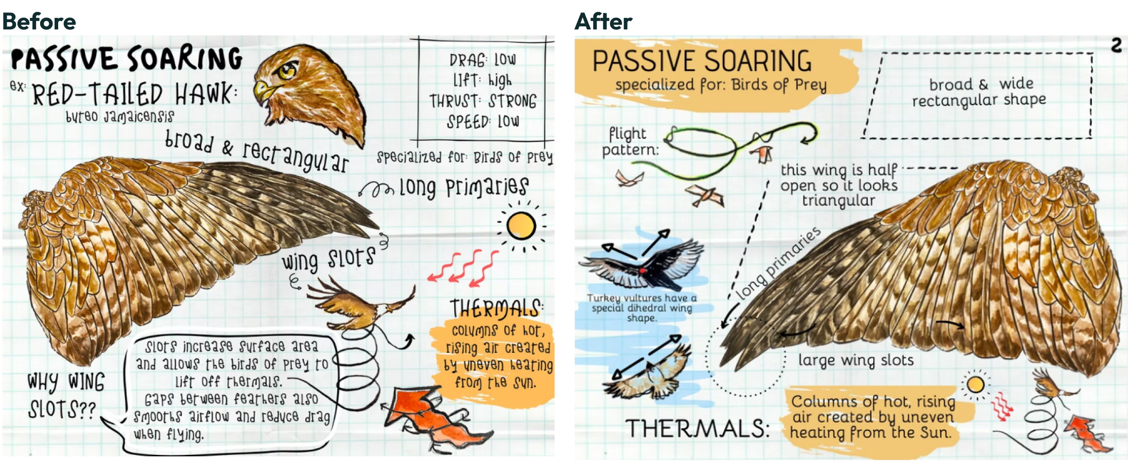
Removing unnecessary information helped clean up the page layout and make the wing type the center of attention.
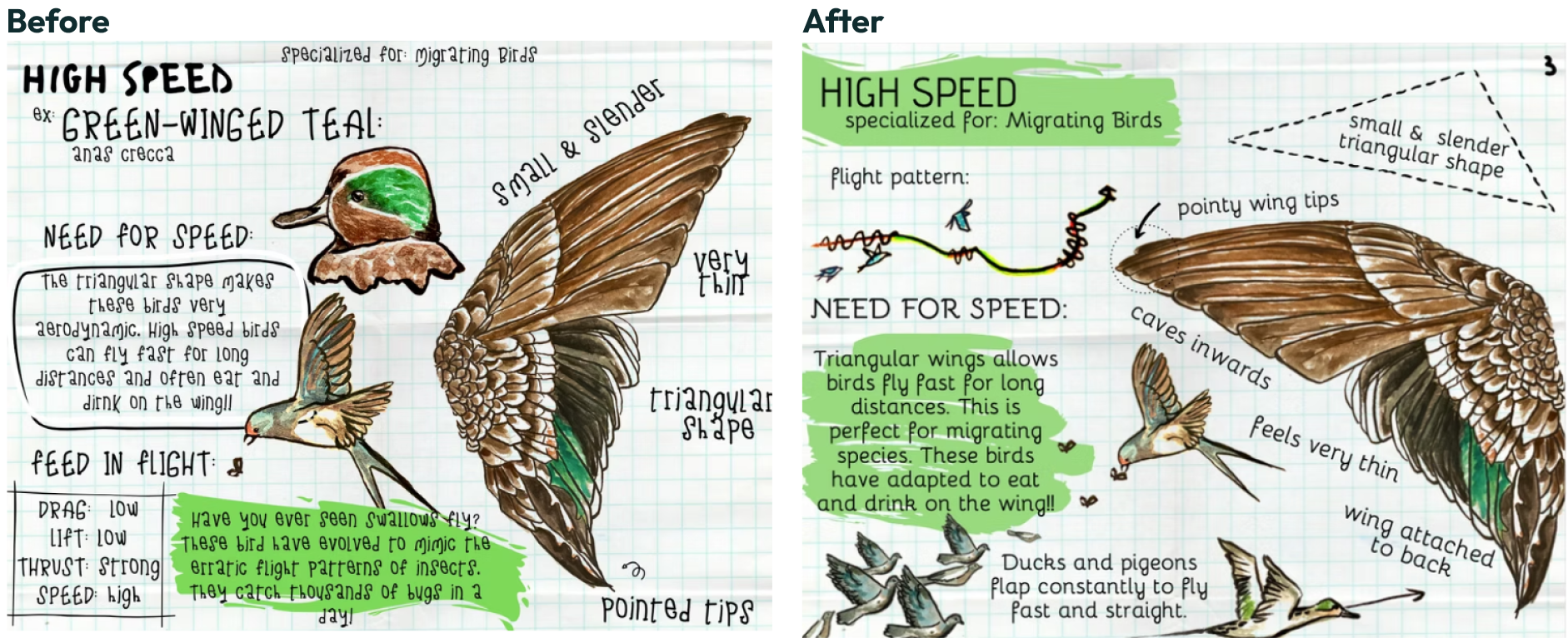
Adding more different birds helped give visual examples for the different wing types.
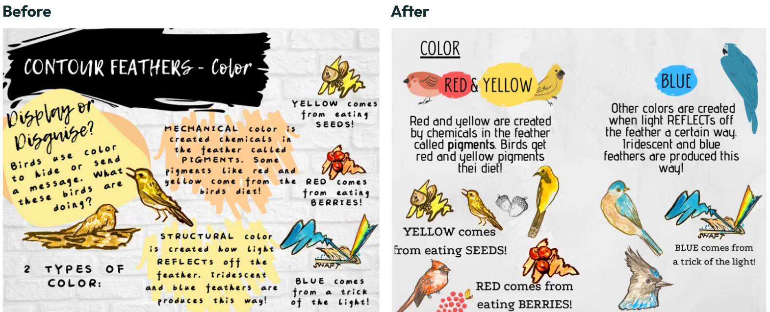
Way too much text initially. There needed to be more of a connection between color and feathers. I removed the camouflage fact and focused on better showing the difference between red/yellow coloring and blue.
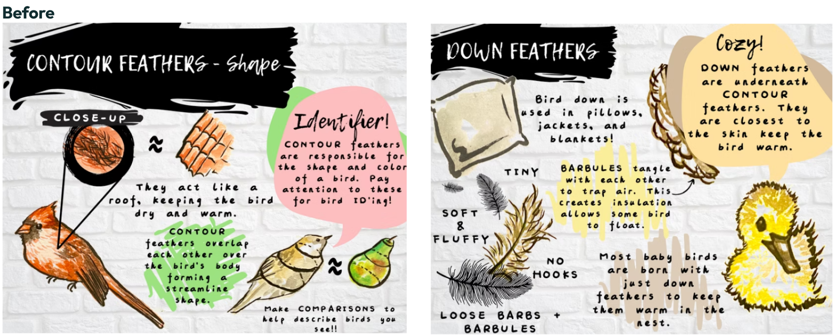
Before: Too much empty space and text on both pages. Also needed more of a connection on identifying feathers.
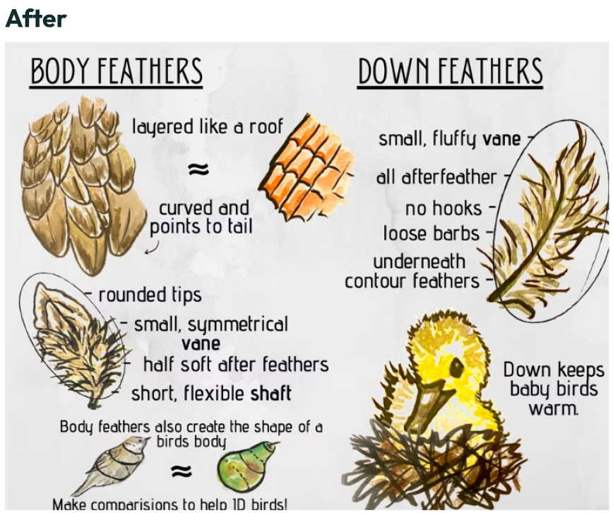
After: I merged both contour/body and down feather types into one page. I added more feather identifying characteristics and described how body feathers lay on a birds body.
Key Learnings
Content Knowledge Matters: I learned you need to prepare and fully understand your content before designing. The quality difference between my Wings and Feathers guides demonstrated this—better content knowledge led to more creative design solutions.
Typography and Information Hierarchy: Font choices make a huge difference in readability and visual appeal. This project taught me to prioritize how readers should engage with information through sizing, bold text, color blocks, and spatial arrangement.
Design Iteration Process: I experienced how challenging it is to balance visual appeal with clear communication, and learned that finding the right middle ground takes multiple iterations.
Results and Impact
The project resulted in two digital 7-page field guides that are easy to read, practical for indoor and outdoor use, and complement BSP's curriculum. It was awarded the Webster Fellows Award ($1500) for advancing natural history education.
The timing worked well for BSP—when quarantine hit and they moved to virtual lessons, my Wings field guide became a key part of their Wings lesson sequence. Kevin noted the digital field guide's value for online student interaction and wing identification. The BSP lesson sequence using the Wings guide is now posted on the Santa Cruz Office of Education website [Seventh Grade > Lesson 3 Bird Wings Discovery Swap > Slide 6].

Bird School Project
Education Design | Illustration | User Research
I worked with the Bird School Project to create 2 custom kid-friendly field guides for their curriculum. I was the sole designer and was responsible for everything from research, design, and implementation. This was a 6-month long project.
The Context
During my internship with Bird School Project (BSP), I worked as an outdoor education instructor. BSP is a nonprofit that partners with Santa Cruz middle school science teachers to teach students scientific thinking through birdwatching. We'd visit classrooms for 4 consecutive lessons covering different aspects of bird observation.
Each class included indoor sessions covering basics like bird characteristics and flight evolution, followed by outdoor sessions where students used binoculars and field guides to observe birds in their school backyard. Students would note bird behavior, coloration, calls, and flight patterns, then form hypotheses and share findings.
Noticing a Problem
I noticed students' attention was most likely to wander during the indoor classroom sessions. Walking around to check on groups, I realized our teaching materials weren't working well for this age group—mostly dense ornithology field guides and natural history books with small text that weren't kid-friendly.
When I carried my small sketchbook for personal notes, kids showed more interest and willingness to engage. I saw similar increased engagement during outdoor sessions when I sketched observations alongside students. After seeing my sketches of the birds we observed, students became more excited about making their own observations and sharing them. My supervisor had also noticed this difference and commented on how my sketches captured students' attention.
Example of some of the birding books used at BSP.
The Opportunity
When my internship ended, my supervisor Kevin and I discussed the idea of creating custom field guide booklets to complement the course units. After seeing that existing educational materials weren't appealing to younger audiences, we decided to develop kid-friendly field guides that both BSP and the general public could use. We started the project at the beginning of the next school year, first determining what was realistic to complete in 3 months. We settled on covering 2 units: Wings and Feathers.
The Design Process
Planning and Research
I made small thumbnail sketches and used my intern experience to organize what information to include and how to structure it. I was responsible for all illustration, design, and content writing.
Sketching helped me get ideas flowing. Working on paper always felt less final than working directly on Canva.
Creating the Illustrations
I created over 30 watercolor paintings of birds, wings, and feathers, working from real specimens using taxidermized materials from the natural history museum. I chose to hand-draw and color illustrations on paper to achieve a natural sketchbook look, then scanned and uploaded images into Canva for digital arrangement.
Working within Constraints
The small page size actually helped focus my content. I could only fit a title, fun fact, and text labels next to illustrations. This constraint forced me to be concise and clear.
Design Challenges and Solutions
Wings Guide Issues
My main challenge was breaking down information into standard characteristics for each wing type and formatting this clearly. I learned to use color blocks to separate information and prevent pages from feeling text-heavy. I also improved image distribution so they didn't cluster in the middle or edges.
After several reviews, I found a page template to follow so all the wing pages would include:
- Wing Name & Shape
- Specialization
- Flight Pattern
- Labeled Wing
- At least one fun fact
Simplifying the physics of flight for young readers was challenging since concepts like air density, acceleration, and friction are complex. This became a good test of my own understanding.
I removed the advantage and disadvantage boxes for how each wing affected flight forces because it wasn’t concretely useful.
Before
Before: I squeezed all four forces together on one page. Even though everything technically fit, it looked crowded and was hard to read.
After: I split the four forces into two pages, each focusing on one opposing pair of forces. This allowed more depth while improving spacing.
Feathers Guide Issues
I struggled between presenting information in an appealing aesthetic style while keeping it clearly displayed. My first iteration used fonts and bright colors that were too noisy and distracting from the information.
We aimed for a scientist's observational notes style—more descriptive labels, fewer paragraphs. In my second iteration, I toned down the visuals but went too bland. The first version may have been too artistic, but the second felt flat and lifeless.
I was less confident about feather content than wing content, which led me to rely more on words than illustrations in the Feathers guide. I learned that unfamiliarity with content can be a mental block to creative design solutions.
Feedback and Iteration
My guides were reviewed by educators from BEETLES (science teaching organization for field instructors). The content feedback was positive, but visual design and page layouts needed work.
Key suggested changes:
- Make pages look like field journal entries
- Avoid unnecessarily complex vocabulary
- Simplify font types
- Ensure information is clearly labeled
I changed to more readable font, established a clear template, and color scheme.
Removing unnecessary information helped clean up the page layout and make the wing type the center of attention.
Adding more different birds helped give visual examples for the different wing types.
Way too much text initially. There needed to be more of a connection between color and feathers. I removed the camouflage fact and focused on better showing the difference between red/yellow coloring and blue.
Before: Too much empty space and text on both pages. Also needed more of a connection on identifying feathers.
After: I merged both contour/body and down feather types into one page. I added more feather identifying characteristics and described how body feathers lay on a birds body.
Key Learnings
Content Knowledge Matters: I learned you need to prepare and fully understand your content before designing. The quality difference between my Wings and Feathers guides demonstrated this—better content knowledge led to more creative design solutions.
Typography and Information Hierarchy: Font choices make a huge difference in readability and visual appeal. This project taught me to prioritize how readers should engage with information through sizing, bold text, color blocks, and spatial arrangement.
Design Iteration Process: I experienced how challenging it is to balance visual appeal with clear communication, and learned that finding the right middle ground takes multiple iterations.
Results and Impact
The project resulted in two digital 7-page field guides that are easy to read, practical for indoor and outdoor use, and complement BSP's curriculum. It was awarded the Webster Fellows Award ($1500) for advancing natural history education.
The timing worked well for BSP—when quarantine hit and they moved to virtual lessons, my Wings field guide became a key part of their Wings lesson sequence. Kevin noted the digital field guide's value for online student interaction and wing identification. The BSP lesson sequence using the Wings guide is now posted on the Santa Cruz Office of Education website [Seventh Grade > Lesson 3 Bird Wings Discovery Swap > Slide 6].
