Cratejoy
E-Commerce | User Experience | Design Systems
I worked with Cratejoy to revamp their e-commerce website. I was the one of three designers and was responsible for research, design, and implementation. This was a 3-month long project that was happening concurrent with other projects at Brandcave (design agency) .
Design Problem
Cratejoy's subscription box marketplace presented a unique challenge: customers faced decision fatigue when confronted with hundreds of subscription options across categories like beauty, food, lifestyle, and hobbies. Unlike single-product purchases, subscription boxes require ongoing commitment, making the decision-making process more complex. Users needed to understand not just what they were buying, but whether they'd want to receive similar items monthly.
Research Insights
Through competitive analysis of other e-commerce websites (ie: Amazon, Wish, Walmart, Target, Etsy, and Wayfair...), I identified that Cratejoy was missing essential trust-building features that drive conversions.
Critical gaps discovered:
- Lack of clear product information hierarchy made it difficult to quickly assess value
- Missing purchase protection messaging left customers uncertain about transaction security
- Basic product cards provided insufficient information for confident decision-making
- Poor visual trust signals like seller badges or prominent ratings displays
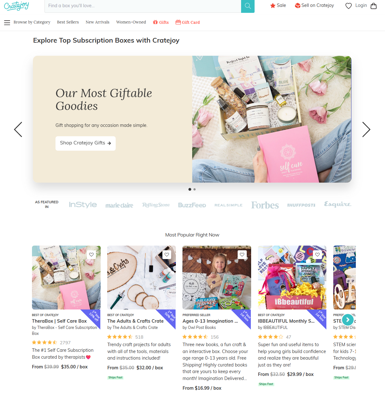
Old Cratejoy home page (early 2024) with cluttered product cards.
Design Challenge & Constraints
The primary challenge was creating a comprehensive trust-building system that worked across multiple touchpoints while maintaining Cratejoy's existing design patterns and technical constraints:
- Technical limitations: Working within existing component libraries and development timelines
- Content variability: Designing for long product names and descriptions across responsive layouts
- User journey complexity: Addressing confidence barriers at different stages (browsing → evaluation → purchase)
- Brand consistency: Integrating new trust elements while maintaining Cratejoy's playful, approachable aesthetic
Process
Starting with HTML-to-Figma plugin captures of current pages, I properly componentized existing designs before implementing improvements. The process prioritized quick wins—features that were light lifts for both design and development but offered high impact.
My approach:
- Audit existing patterns - Captured and organized current design system components
- Competitive research - Analyzed trust-building strategies from successful platforms
- Strategic prioritization - Focused on high-impact, low-effort improvements first
- Rapid prototyping - Created high-fidelity designs with quick stakeholder review cycles
- Stakeholder review - Iterative refinement before developer handoff
Solution
From my research, I saw how successful e-commerce platforms build confidence through layered trust signals, from initial product discovery through final purchase, rather than relying on a single conversion point. So I designed a comprehensive trust-building system that addressed confidence barriers at three critical touchpoints throughout the purchase journey:
1. Enhanced Product Discovery (New Product Cards)
Users were struggling to make confident purchasing decisions due to cluttered, inconsistent product displays. The original design buried critical information like pricing and ratings beneath walls of text, while discount badges were nearly invisible against busy product imagery. Trust signals existed but were scattered and hard to locate, creating friction in the discovery process.
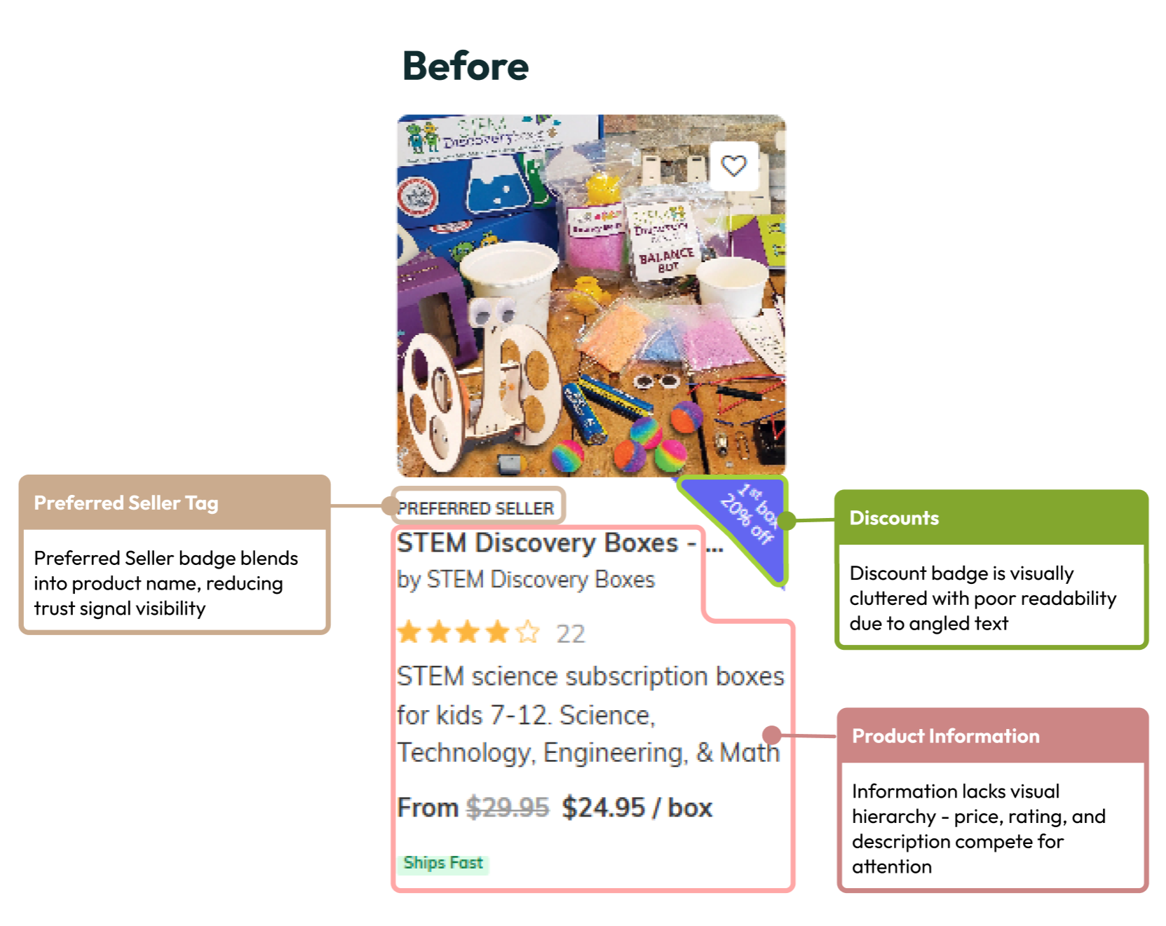
Cratejoy old products card
I redesigned the product cards with a focus on immediate comprehension and user confidence. By establishing a clear visual hierarchy, we ensured that essential information, like item name, price, and seller credentials, became instantly scannable. Each element now has purposeful placement and consistent typography that guides the eye naturally through the decision-making process.
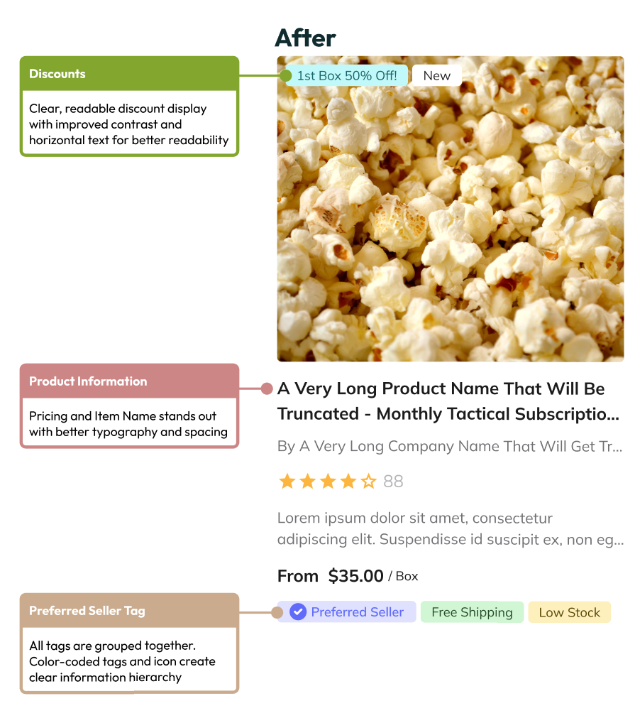
Cratejoy redesigned products card
The new design prominently features trust badges like "Preferred Seller" alongside other filterable tags, creating a cohesive system that helps users quickly identify reliable products. These visual cues work together to reduce cognitive load and build confidence at first glance. The barely-visible discount displays were transformed into prominent, high-contrast elements that immediately catch the user's attention. The improved readability ensures that savings opportunities become a key driver in the discovery experience rather than a hidden afterthought.
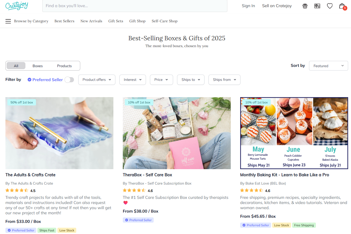
Cleaner collections page using the new product card layout
- Purchase Protection System (Cratejoy Confidence)
E-commerce users, particularly those considering subscription services, often hesitate at checkout due to concerns about commitment, cancellation policies, and unexpected charges. Without clear reassurance about purchase protection, potential customers abandon their carts, leaving revenue on the table and trust unestablished.
We developed a comprehensive purchase protection program that needed to feel authentic to the Cratejoy brand while addressing real user concerns. The "Cratejoy Confidence" branding used alliterative copy that felt natural to the brand voice, creating a memorable trust signal that users could easily recognize and remember.
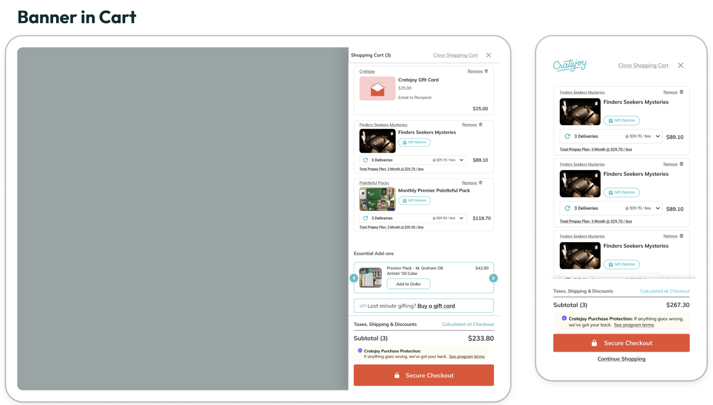
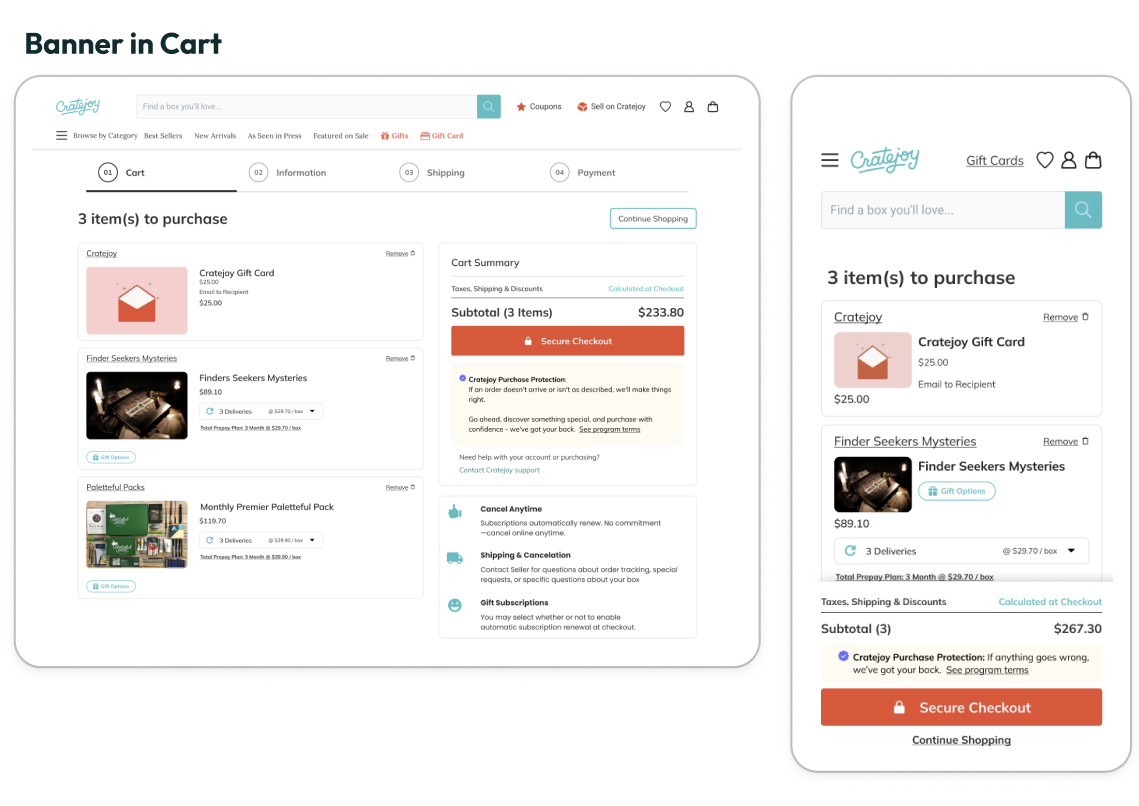
Cart sidebar with banner in cart summary
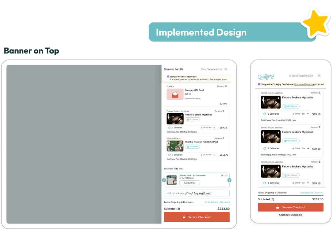
Cart sidebar with banner at the top
The protection banner needed strategic placement to maximize effectiveness without disrupting the purchase flow. We identified two critical touchpoints—the cart sidebar and the main cart page—and tested two distinct placement strategies to determine where users would be most receptive to trust messaging.We compared placing the banner within the cart summary (integrated approach) against positioning it at the top of the page (prominent approach). The integrated placement felt natural within the purchase context, while the top placement commanded immediate attention before users engaged with their cart contents.
Cart page with banner in the cart summary
Cart page with banner at the top
The winning design demonstrates that purchase protection messaging works best as proactive reassurance rather than reactive support. When users encounter trust signals before engaging with transaction details, they approach the entire checkout process with greater confidence and reduced anxiety.
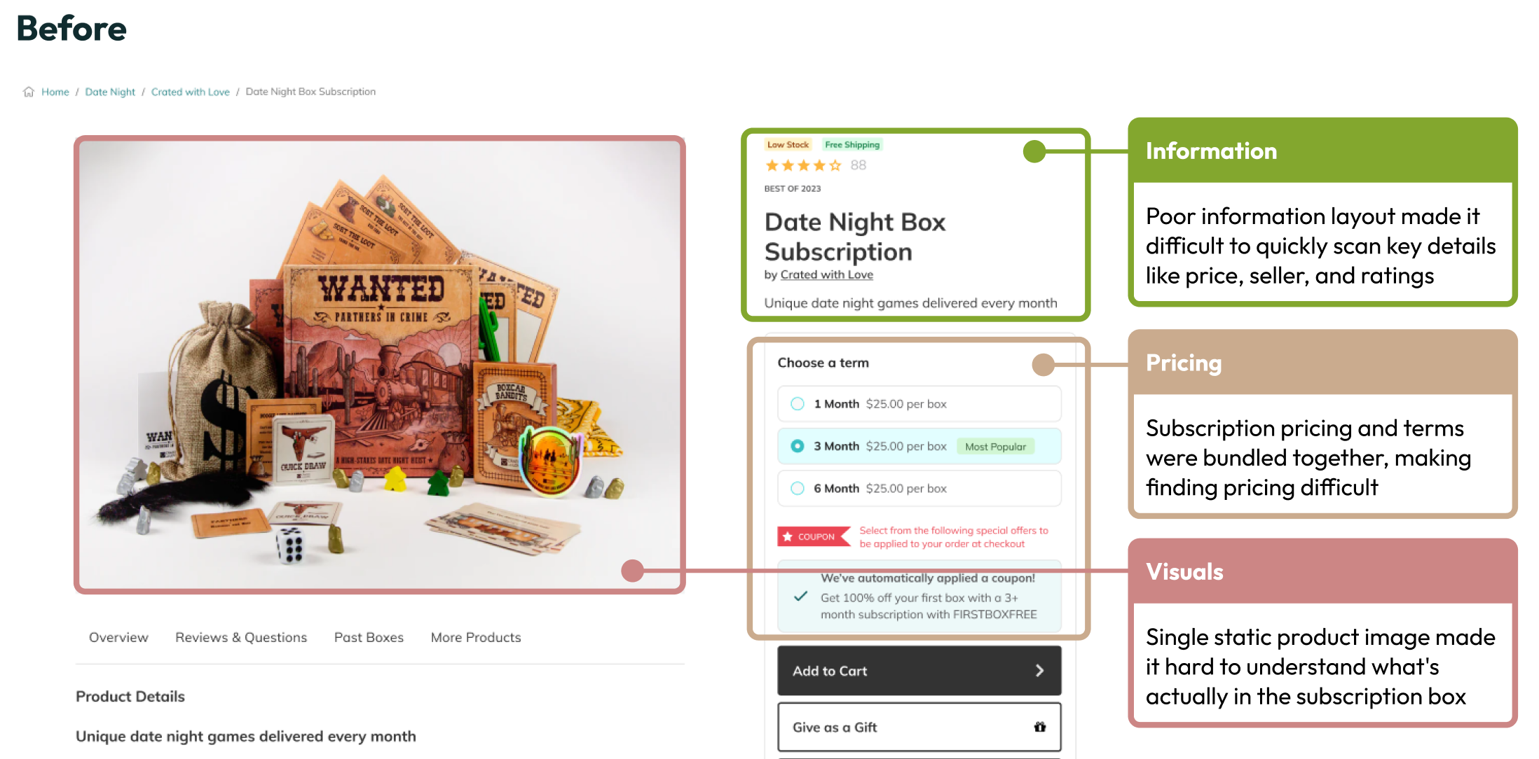
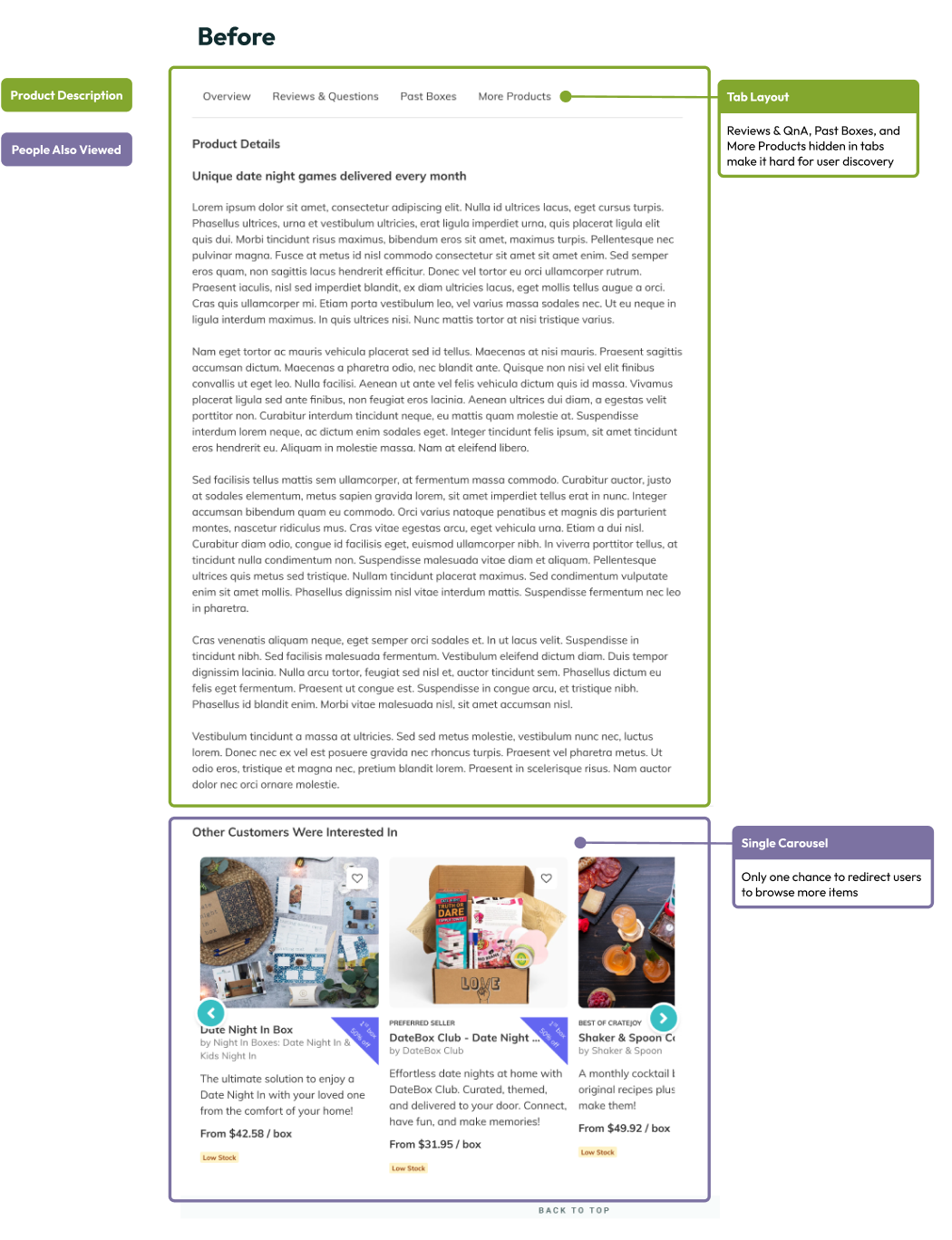
- Comprehensive Product Evaluation (Product Details Redesign)
The original product details page followed outdated design patterns that prioritized space-saving over user experience. Critical information was locked away behind tabs, forcing users to click through multiple sections to understand what they were purchasing. With only a single product image and minimal cross-selling opportunities, users lacked the comprehensive view needed to make confident purchase decisions.
Drawing inspiration from proven e-commerce leaders, we reimagined the product details experience around the principle of progressive disclosure through scrolling rather than clicking. The goal was to create a seamless, exploratory journey that revealed information naturally as users engaged with the content.
Competitive analysis of successful e-commerce patterns
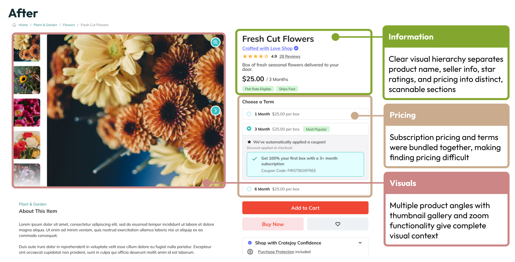
We replaced the single static product image with a rich gallery system that provides complete visual understanding. Users can now explore products from multiple angles and contexts, building confidence through comprehensive visual information rather than imagination.
Cratejoy products page
Pricings, ratings, and product tags previously bundled together in confusing formats, now receive dedicated space with clear visual hierarchy.
Cratejoy products page
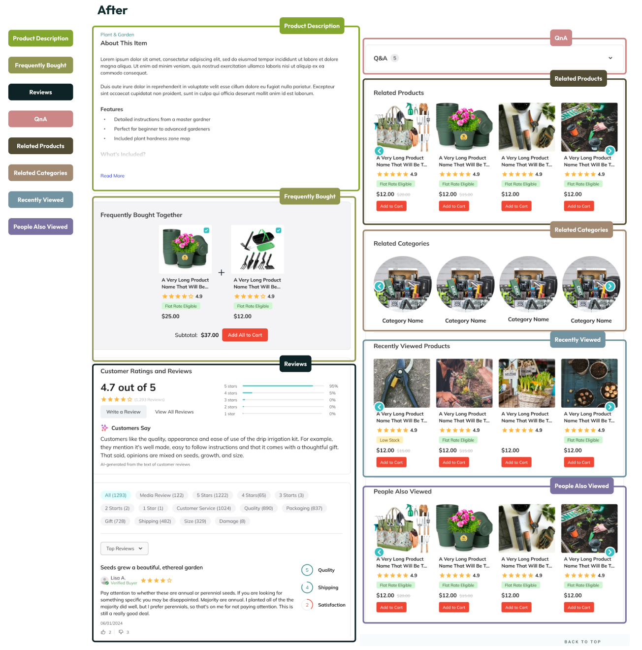
The redesigned information architecture transforms buried content into a scannable, scrollable experience. Instead of guessing what might be behind each tab, users can now effortlessly flow through structured sections—product details, pricing, reviews, and recommendations—following their natural browsing behavior. Users can easily understand their commitment and options without deciphering complex layouts or hunting through tabs.
Cratejoy products page
The new design introduces five distinct product discovery sections: Frequently Bought Together, Related Products, Related Categories, Recently Viewed, and People Also Viewed. This creates multiple pathways for users to discover complementary items and increases engagement through personalized recommendations.
Our approach recognizes that scrolling feels more natural and less committal than clicking. Users can passively consume information at their own pace, while strategic placement of cross-selling sections captures interest at optimal moments in their decision-making journey.
Cratejoy products page
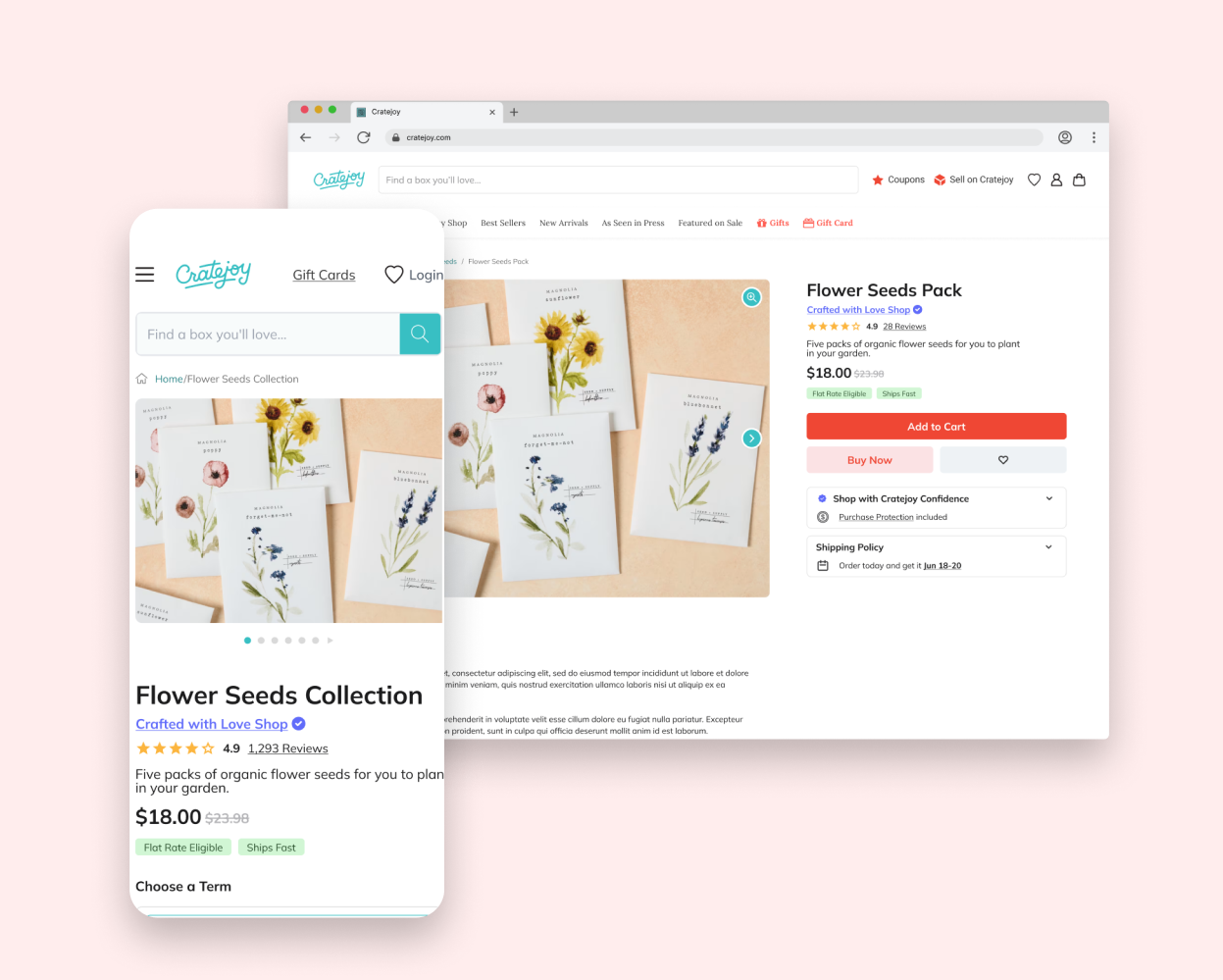
What Launched
The final implementation demonstrates how companies adapt design recommendations to fit their specific constraints and priorities. While our comprehensive redesign provided one approach to improving user experience, the company's execution reveals their own strategic decisions and creative solutions.
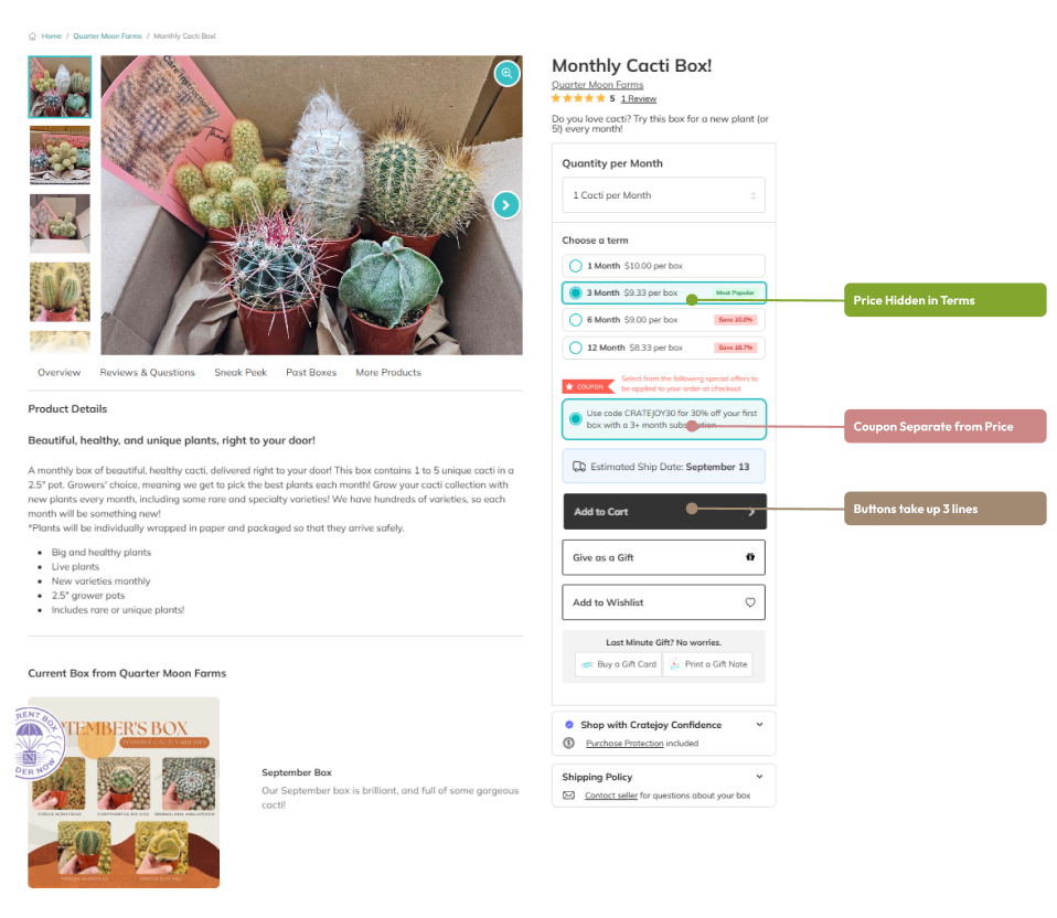
Our design emphasized transparent pricing hierarchy with prominent discount displays and streamlined CTAs. The company chose to maintain pricing within subscription terms and separate coupon information from the main price display. Their CTA buttons span three lines and use a different color treatment than the bold red we suggested, reflecting their own design system decisions.
Recreating prvious site using HTML to design
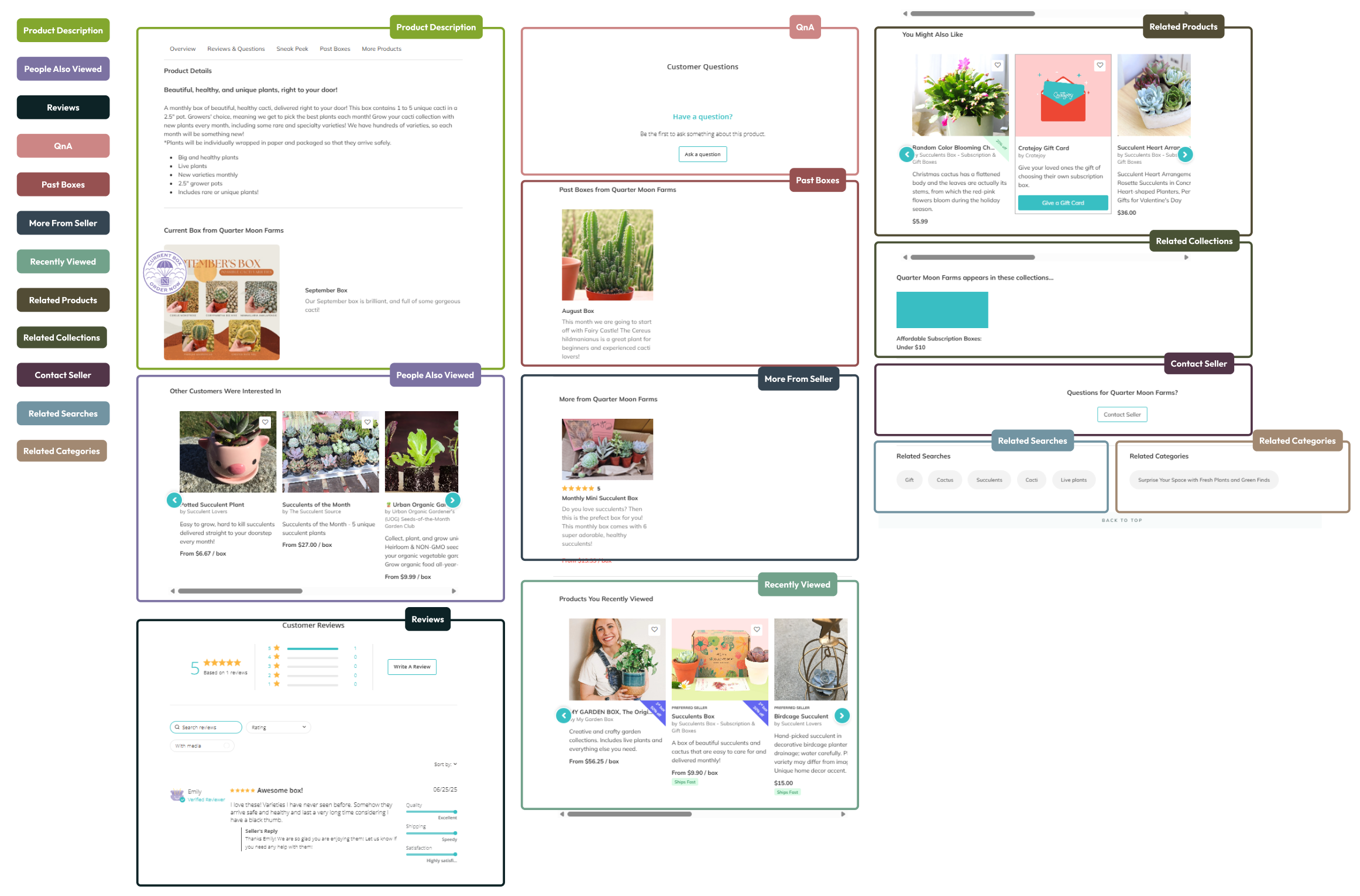
While we recommended eliminating tabs entirely in favor of pure scrolling, the company developed an interesting hybrid approach. They retained the familiar tab structure but transformed the tabs into sticky navigation elements that serve as scroll anchor points. This solution maintains user control over navigation while still enabling the progressive content discovery that scrolling provides.
Our approach prioritized user discovery through sections like "Frequently Bought Together" and "Related Products," designed to introduce users to new products and interests. The company's implementation reflects different strategic priorities, featuring seller-focused sections like "More from Seller" and "Contact Seller," alongside user history-based sections such as "Recently Viewed," "Related Searches," and "Related Categories."
Recreating prvious site using HTML to design
Our approach prioritized user discovery through sections like "Frequently Bought Together" and "People Also Viewed," designed to introduce users to new products and interests. The company's implementation reflects different strategic priorities, featuring seller-focused sections like "More from Seller" and "Contact Seller," alongside user history-based sections such as "Recently Viewed," "Related Searches," and "Related Categories."
Reflection
Working on Cratejoy's e-commerce redesign provided invaluable insights into the complexities of designing within established digital ecosystems. This project challenged me to balance user-centered design principles with the practical realities of existing design systems, technical constraints, and business priorities.The gap between design recommendations and final implementation revealed crucial lessons about the collaborative nature of digital product development. Our approach of progressive disclosure through scrolling rather than clicking recognized that user engagement is as much about reducing friction as it is about organizing content. Seeing how the company adapted our suggestions, like transforming our "eliminate tabs" recommendation into the innovative sticky navigation solution, demonstrated that the best designs often emerge from the tension between idealistic vision and practical constraints. Their hybrid approach actually solved problems we hadn't fully considered while maintaining the core benefits of our scrolling concept.
Perhaps the most valuable lesson came from observing how business priorities influenced the final content strategy. While our user-centered approach emphasized discovery and serendipitous exploration, the company's focus on seller-centric and history-based sections reflected different strategic goals. Every design decision ripples through multiple touchpoints, user journeys, and business processes. This experience solidified my understanding that e-commerce design success isn't measured solely by user metrics or aesthetic achievement, but by how well design solutions integrate into and enhance the complex ecosystem of user needs, business goals, technical possibilities, and organizational realities.

Cratejoy
E-Commerce | User Experience | Design Systems
I worked with Cratejoy to revamp their e-commerce website. I was the one of three designers and was responsible for research, design, and implementation. This was a 3-month long project that was happening concurrent with other projects at Brandcave (design agency) .
Design Problem
Cratejoy's subscription box marketplace presented a unique challenge: customers faced decision fatigue when confronted with hundreds of subscription options across categories like beauty, food, lifestyle, and hobbies. Unlike single-product purchases, subscription boxes require ongoing commitment, making the decision-making process more complex. Users needed to understand not just what they were buying, but whether they'd want to receive similar items monthly.
Research Insights
Through competitive analysis of other e-commerce websites (ie: Amazon, Wish, Walmart, Target, Etsy, and Wayfair...), I identified that Cratejoy was missing essential trust-building features that drive conversions.
Critical gaps discovered:
- Lack of clear product information hierarchy made it difficult to quickly assess value
- Missing purchase protection messaging left customers uncertain about transaction security
- Basic product cards provided insufficient information for confident decision-making
- Poor visual trust signals like seller badges or prominent ratings displays
Old Cratejoy home page (early 2024) with cluttered product cards.
Design Challenge & Constraints
The primary challenge was creating a comprehensive trust-building system that worked across multiple touchpoints while maintaining Cratejoy's existing design patterns and technical constraints:
- Technical limitations: Working within existing component libraries and development timelines
- Content variability: Designing for long product names and descriptions across responsive layouts
- User journey complexity: Addressing confidence barriers at different stages (browsing → evaluation → purchase)
- Brand consistency: Integrating new trust elements while maintaining Cratejoy's playful, approachable aesthetic
Process
Starting with HTML-to-Figma plugin captures of current pages, I properly componentized existing designs before implementing improvements. The process prioritized quick wins—features that were light lifts for both design and development but offered high impact.
My approach:
- Audit existing patterns - Captured and organized current design system components
- Competitive research - Analyzed trust-building strategies from successful platforms
- Strategic prioritization - Focused on high-impact, low-effort improvements first
- Rapid prototyping - Created high-fidelity designs with quick stakeholder review cycles
- Stakeholder review - Iterative refinement before developer handoff
Solution
From my research, I saw how successful e-commerce platforms build confidence through layered trust signals, from initial product discovery through final purchase, rather than relying on a single conversion point. So I designed a comprehensive trust-building system that addressed confidence barriers at three critical touchpoints throughout the purchase journey:
1. Enhanced Product Discovery (New Product Cards)
Users were struggling to make confident purchasing decisions due to cluttered, inconsistent product displays. The original design buried critical information like pricing and ratings beneath walls of text, while discount badges were nearly invisible against busy product imagery. Trust signals existed but were scattered and hard to locate, creating friction in the discovery process.
Cratejoy old products card
I redesigned the product cards with a focus on immediate comprehension and user confidence. By establishing a clear visual hierarchy, we ensured that essential information, like item name, price, and seller credentials, became instantly scannable. Each element now has purposeful placement and consistent typography that guides the eye naturally through the decision-making process.
Cratejoy redesigned products card
The new design prominently features trust badges like "Preferred Seller" alongside other filterable tags, creating a cohesive system that helps users quickly identify reliable products. These visual cues work together to reduce cognitive load and build confidence at first glance. The barely-visible discount displays were transformed into prominent, high-contrast elements that immediately catch the user's attention. The improved readability ensures that savings opportunities become a key driver in the discovery experience rather than a hidden afterthought.
Cleaner collections page using the new product card layout
- Purchase Protection System (Cratejoy Confidence)
E-commerce users, particularly those considering subscription services, often hesitate at checkout due to concerns about commitment, cancellation policies, and unexpected charges. Without clear reassurance about purchase protection, potential customers abandon their carts, leaving revenue on the table and trust unestablished.
We developed a comprehensive purchase protection program that needed to feel authentic to the Cratejoy brand while addressing real user concerns. The "Cratejoy Confidence" branding used alliterative copy that felt natural to the brand voice, creating a memorable trust signal that users could easily recognize and remember.
Cart sidebar with banner in cart summary
Cart sidebar with banner at the top
The protection banner needed strategic placement to maximize effectiveness without disrupting the purchase flow. We identified two critical touchpoints—the cart sidebar and the main cart page—and tested two distinct placement strategies to determine where users would be most receptive to trust messaging.We compared placing the banner within the cart summary (integrated approach) against positioning it at the top of the page (prominent approach). The integrated placement felt natural within the purchase context, while the top placement commanded immediate attention before users engaged with their cart contents.
Cart page with banner in the cart summary
Cart page with banner at the top
The winning design demonstrates that purchase protection messaging works best as proactive reassurance rather than reactive support. When users encounter trust signals before engaging with transaction details, they approach the entire checkout process with greater confidence and reduced anxiety.
- Comprehensive Product Evaluation (Product Details Redesign)
The original product details page followed outdated design patterns that prioritized space-saving over user experience. Critical information was locked away behind tabs, forcing users to click through multiple sections to understand what they were purchasing. With only a single product image and minimal cross-selling opportunities, users lacked the comprehensive view needed to make confident purchase decisions.
Drawing inspiration from proven e-commerce leaders, we reimagined the product details experience around the principle of progressive disclosure through scrolling rather than clicking. The goal was to create a seamless, exploratory journey that revealed information naturally as users engaged with the content.
Competitive analysis of successful e-commerce patterns
We replaced the single static product image with a rich gallery system that provides complete visual understanding. Users can now explore products from multiple angles and contexts, building confidence through comprehensive visual information rather than imagination.
Cratejoy products page
Pricings, ratings, and product tags previously bundled together in confusing formats, now receive dedicated space with clear visual hierarchy.
Cratejoy products page
The redesigned information architecture transforms buried content into a scannable, scrollable experience. Instead of guessing what might be behind each tab, users can now effortlessly flow through structured sections—product details, pricing, reviews, and recommendations—following their natural browsing behavior. Users can easily understand their commitment and options without deciphering complex layouts or hunting through tabs.
Cratejoy products page
The new design introduces five distinct product discovery sections: Frequently Bought Together, Related Products, Related Categories, Recently Viewed, and People Also Viewed. This creates multiple pathways for users to discover complementary items and increases engagement through personalized recommendations.
Our approach recognizes that scrolling feels more natural and less committal than clicking. Users can passively consume information at their own pace, while strategic placement of cross-selling sections captures interest at optimal moments in their decision-making journey.
Cratejoy products page
What Launched
The final implementation demonstrates how companies adapt design recommendations to fit their specific constraints and priorities. While our comprehensive redesign provided one approach to improving user experience, the company's execution reveals their own strategic decisions and creative solutions.
Our design emphasized transparent pricing hierarchy with prominent discount displays and streamlined CTAs. The company chose to maintain pricing within subscription terms and separate coupon information from the main price display. Their CTA buttons span three lines and use a different color treatment than the bold red we suggested, reflecting their own design system decisions.
Recreating prvious site using HTML to design
While we recommended eliminating tabs entirely in favor of pure scrolling, the company developed an interesting hybrid approach. They retained the familiar tab structure but transformed the tabs into sticky navigation elements that serve as scroll anchor points. This solution maintains user control over navigation while still enabling the progressive content discovery that scrolling provides.
Our approach prioritized user discovery through sections like "Frequently Bought Together" and "Related Products," designed to introduce users to new products and interests. The company's implementation reflects different strategic priorities, featuring seller-focused sections like "More from Seller" and "Contact Seller," alongside user history-based sections such as "Recently Viewed," "Related Searches," and "Related Categories."
Recreating prvious site using HTML to design
Our approach prioritized user discovery through sections like "Frequently Bought Together" and "People Also Viewed," designed to introduce users to new products and interests. The company's implementation reflects different strategic priorities, featuring seller-focused sections like "More from Seller" and "Contact Seller," alongside user history-based sections such as "Recently Viewed," "Related Searches," and "Related Categories."
Reflection
Working on Cratejoy's e-commerce redesign provided invaluable insights into the complexities of designing within established digital ecosystems. This project challenged me to balance user-centered design principles with the practical realities of existing design systems, technical constraints, and business priorities.The gap between design recommendations and final implementation revealed crucial lessons about the collaborative nature of digital product development. Our approach of progressive disclosure through scrolling rather than clicking recognized that user engagement is as much about reducing friction as it is about organizing content. Seeing how the company adapted our suggestions, like transforming our "eliminate tabs" recommendation into the innovative sticky navigation solution, demonstrated that the best designs often emerge from the tension between idealistic vision and practical constraints. Their hybrid approach actually solved problems we hadn't fully considered while maintaining the core benefits of our scrolling concept.
Perhaps the most valuable lesson came from observing how business priorities influenced the final content strategy. While our user-centered approach emphasized discovery and serendipitous exploration, the company's focus on seller-centric and history-based sections reflected different strategic goals. Every design decision ripples through multiple touchpoints, user journeys, and business processes. This experience solidified my understanding that e-commerce design success isn't measured solely by user metrics or aesthetic achievement, but by how well design solutions integrate into and enhance the complex ecosystem of user needs, business goals, technical possibilities, and organizational realities.
